

discourse starter of food, culture & travel
discourse starter of food, culture & travel

@beccasaud is an American, writer, University guest Lecturer, Entrepreneur and Content Creator based in Birmingham, UK

fresh original content with a 60% * engagement rate
*Based off TikTok account, industry average is between 1-3.5%
the written word:
-
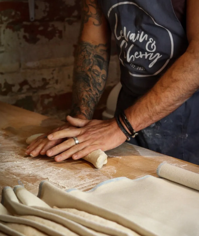
#BeccasBites Podcast Episode 1: Interview with Pascal of Birmingham's Levain and Cherry, One of Britain's Best Bakeries
Welcome to #BeccasBites where each episode will start with a discourse in a bite size quantity and where we chat about all things Food, Culture and Travel.
At age 44 Pascal Bishop is, at his core, serious, a perfectionist and hardworking. You just simply know by looking at his frayed tatted exterior that this guy has lived a life. Like a battered fisherman his presence holds more than what meets the eye, a case you will never fully crack and someone who turns away from the spotlight.
So what does a person like Pascal do? Well, he makes the best croissants I’ve ever had in my life. Ever. No exaggeration. Yes, i’ve been to France. Several times. And it’s not just me. Levain and Cherry were recently recognised by Good Food Guide as one of the best bakeries in the UK.
-

TikTok's Next Biggest Beauty Influencer is Straight, Brown & Male: The Rise of Abdullah Zaidi
Only just this weekend did the first video of Abdullah Zaidi (@thisguyabdullah), a 24-year-old from Toronto, Canada come across my For You Page on TikTok where he was defending his sexuality (straight) while dousing his face in his favourite The Ordinary serum, talking to me in such familiarity that I thought I was on FaceTime with my little brother.
He was a breath of fresh air to me, and so many others. Unserious, with a pink headband topped with a perfectly girlish fluffy bow; unpretentious, without a selfie light blasting our eyelids with full coverage flash; and making jabs and jokes that would surely get him cancelled? (a future day that he relishes and is one of his points in his 5 point plan to become a beauty influencer).
-

Is Living Away from your Family and Friends the Ultimate Relationship Test?
You ever do a DIY project that makes you rethink your whole life?
I’m chiselling away at the double sided tape on my wall (that I used instead of wallpaper paste in an attempt to do less damage to my rental).
What I thought was a cheat code for putting up wallpaper turned into said wallpaper’s edges peeling for months. It bothered me more and more, little by little each time I walked by (which was constantly as its in the hallway that connects our bedroom to the rest of the flat).
curating the world
let's work together
let's work together
From small business to big brands companies, I can help you grow your audience with fresh and engaging content.
Feel free to contact me below to work together. Some examples of the type of work I can produce
Video Food Reviews (grocery food, at home cooking, tastings, restaurant reviews, festivals, cheap eats, and fine dining)
In-depth Interviews (articles with interviews with the owners, chef, celebrity, podcasts etc)
Original User Generated Content (B-roll footage, Round-Ups, Vlogs)
Travel Itineraries (Hotel, Plane, Tourist Attractions, City Guides)
Social Media Consultancy (Branding, Budget, Target audience)
Ad Campaigns (Print, digital, social media: Instagram, TikTok) and more.