branding:
vespiary realty

Client branding
Working with WOC-owned business to develop branding and marketing materials for Real Estate Agency located in Bronxville, NY.


food editorial
//photography//
//copywriting//
//graphic design//
food and drink editorial
Food and drink photography is needs to be both aesthetically as pleasing as it tastes, as does the way it is consumed as a medium. Here I created a mock editorial of London Summer Eats and San Sebastian Summer Eats -all photography, graphics, and writing by myself.


ABOUT
Lots of research went into this project, as well as being graphically pleasing and information is relevant-talking both of the history of each city. Food write-ups for every budget from food trucks to street vendors to michelan starred restaurants.


//creative director //
//photographer //

Purposely chosen black and white imagery interrupt the editorial, almost as seeing the image in both the past and present. Incorporated in the editorial is painting by local artist Kristian Battell, her modern contoured landscape made using a mix of printmaking and oil and acrylic. Her colour palette of oranges and yellows a constant theme. Yellow has the purposeful accent colour is associated with childhood, happiness, cheerfulness: yet used differently here in a muted faded tone to represent those feelings left in the past.
A choice of T-age Williams as the model was intentional, photographer and creative director Rebecca Rampersaud wanted to tell a beautiful fashion editorial story with a black model at the forefront. Themes of youth lost childhood, and nostalgia are universal should be represented that way.
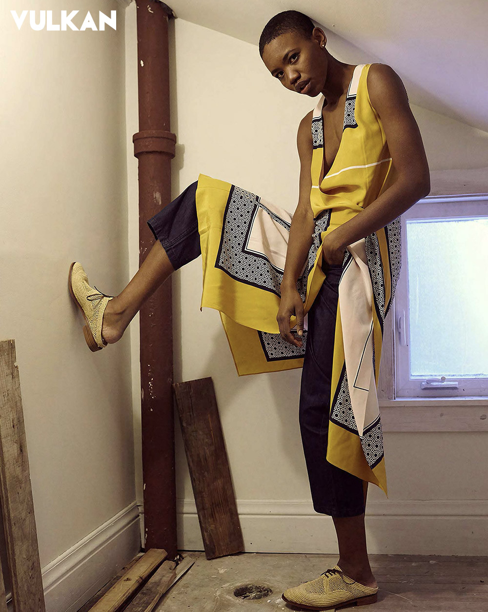
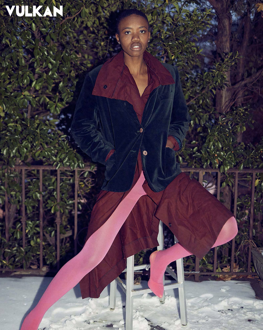
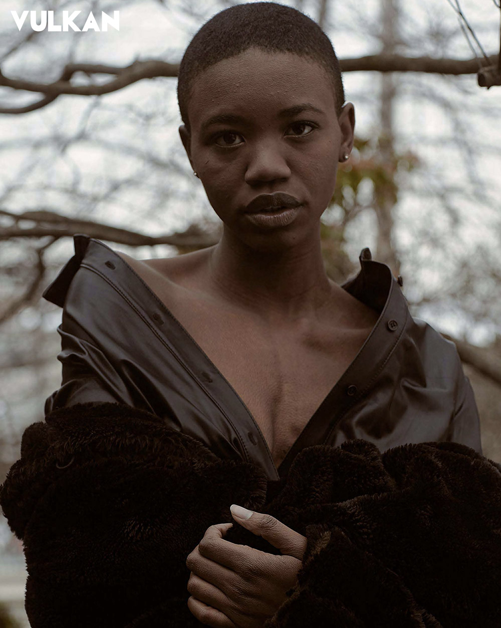
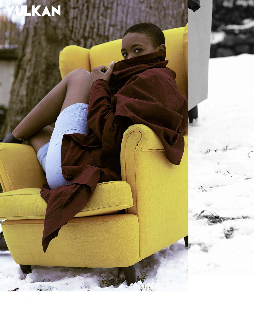
vulkan magazine
The House We Once Grew Up In
Photographer: Rebecca Rampersaud @rebecca.rampersaud
Model: T-Age Williams @highvol_tage with @wilhelminamodels
Stylist: Danielle Hawkins @danielleh_styles
Photo Assistant: CJ Moy (@satchmo)
Retracing the steps of your childhood home evokes strong memories in everyone. It brings you back to a time that you can no longer get back to, but only re-trace. Rooted in this editorial is the feeling of going back home through hallways that hold memories of the past. The idea here was rooted in a woman playing dress up in her mom and dad’s wardrobe and exploring her childhood home bringing to mind the feeling of nostalgia, wistful of a time that has passed.
Stylist Danielle Hawkins played with feminine textures and embellishments mixed with masculine silhouettes, the youthful idea that children don’t know what’s masculine or feminine while playing dress up, just putting together to them what feels right. It is a natural instinct, a curiosity of seeing what feels good together.


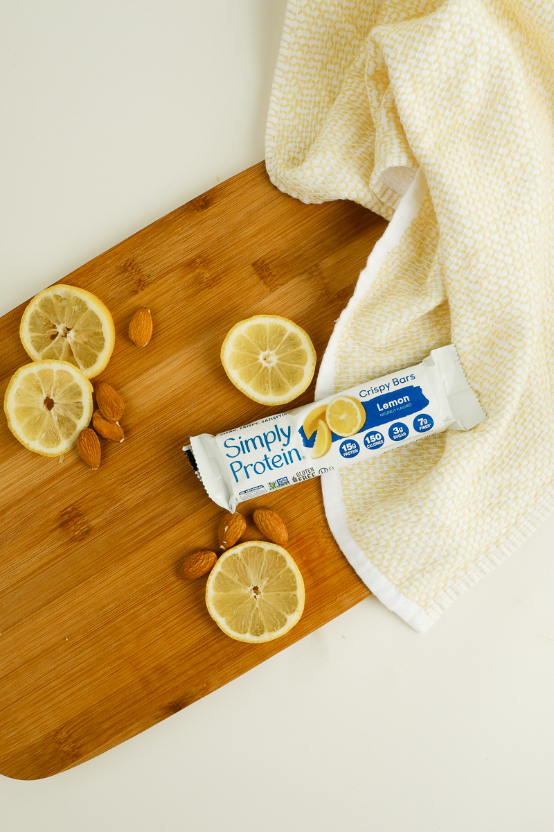
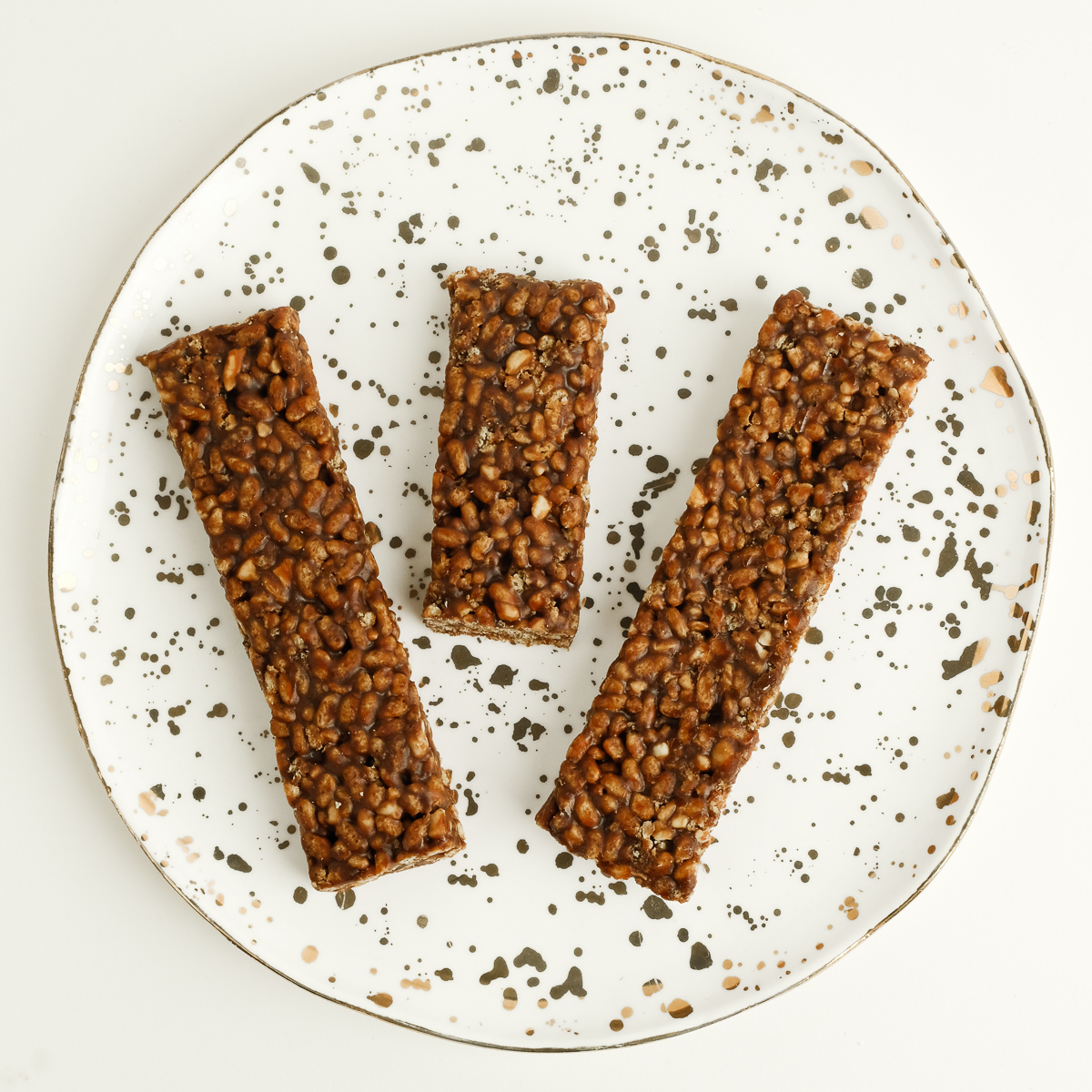
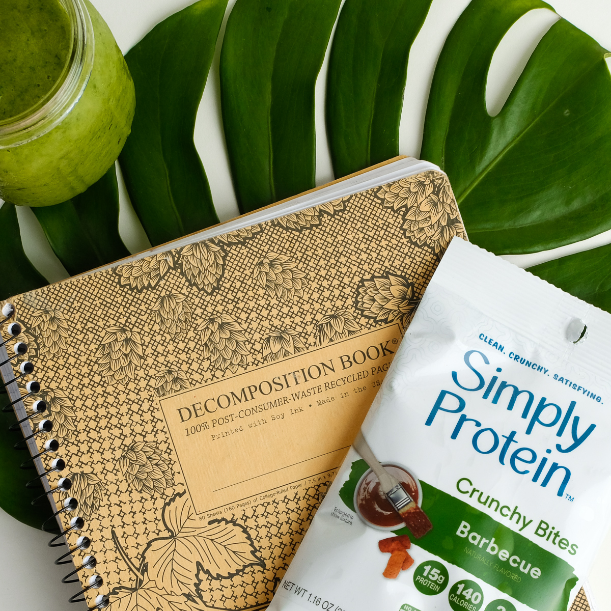
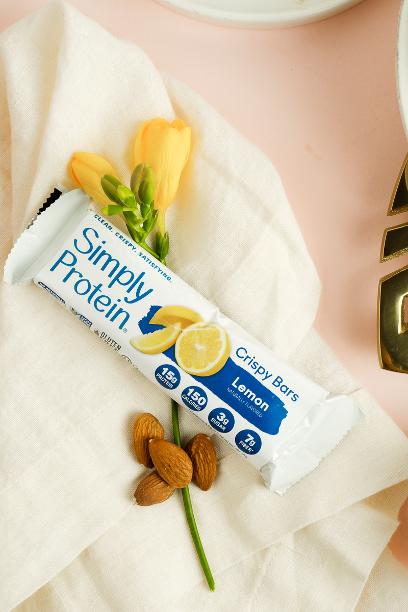
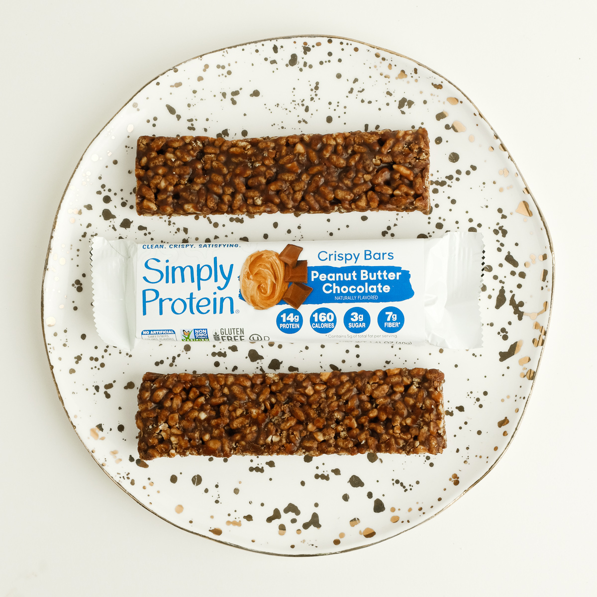
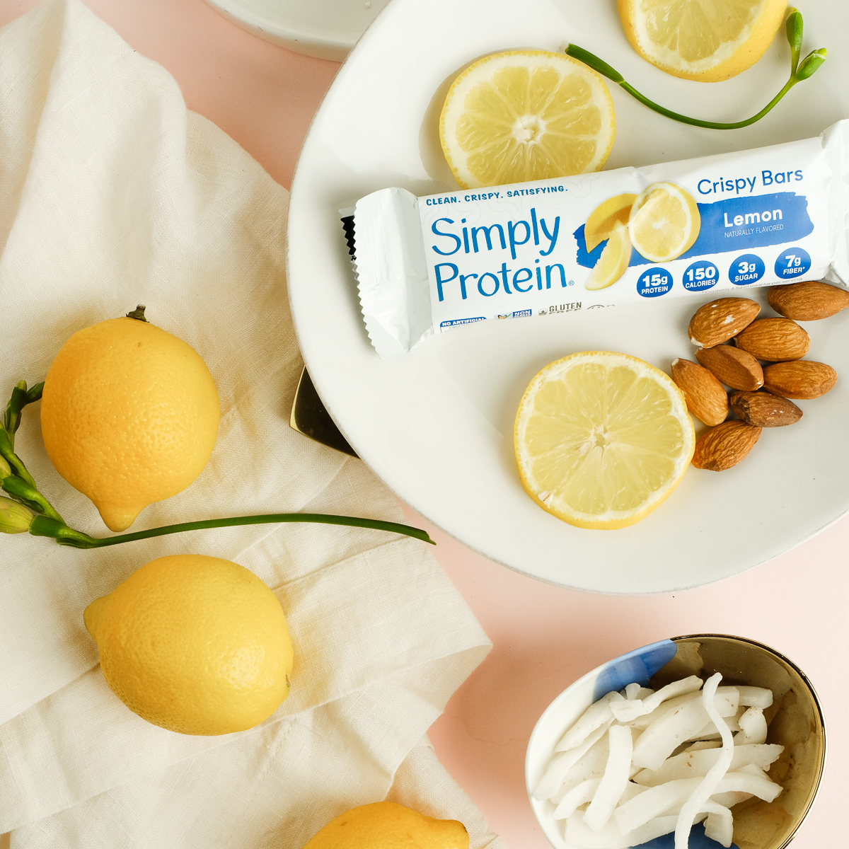
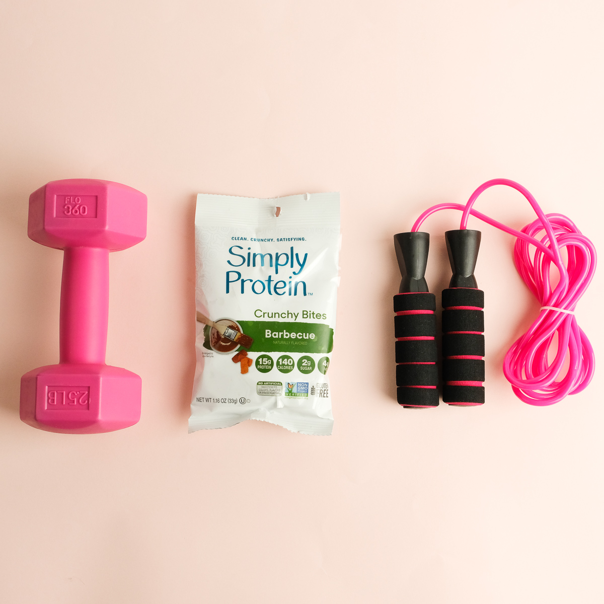
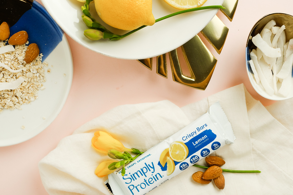
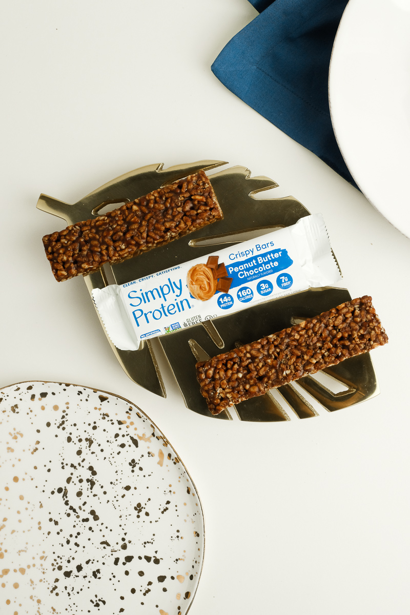
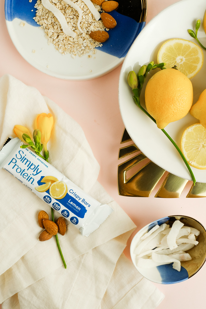
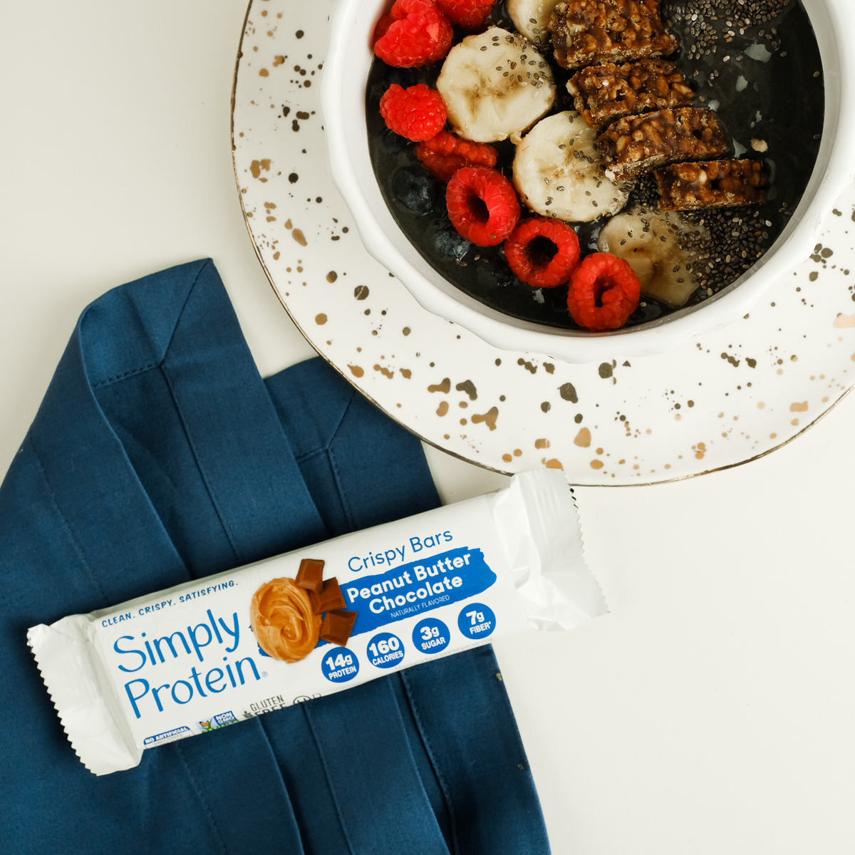
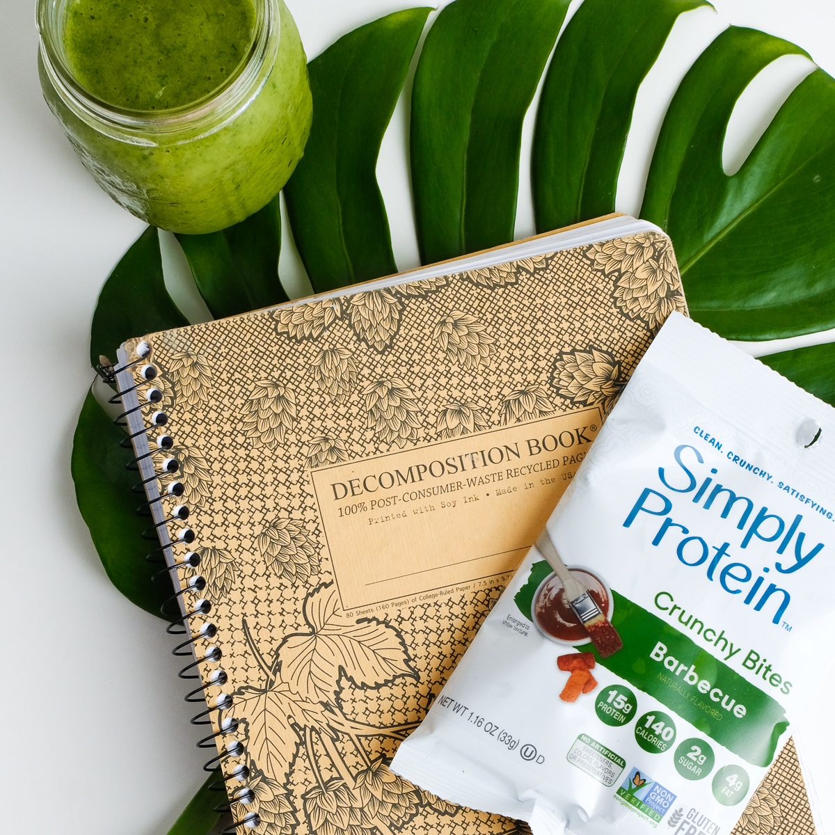
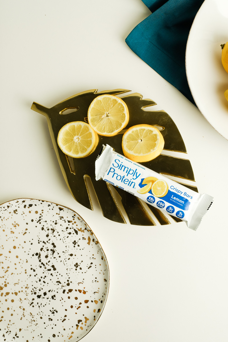
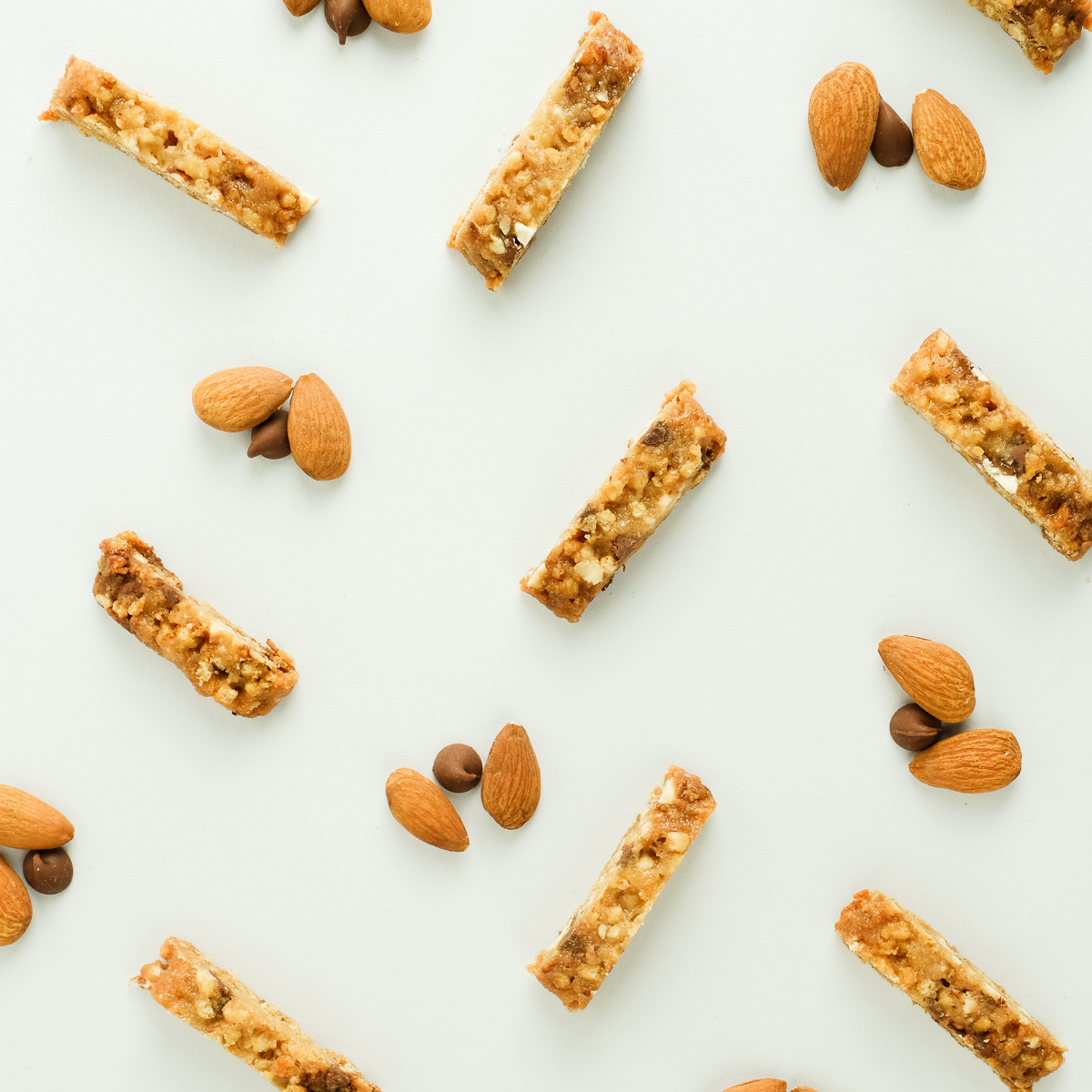
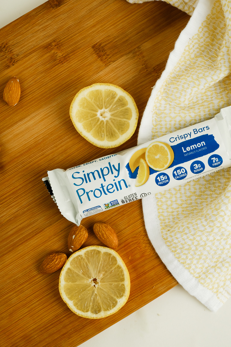
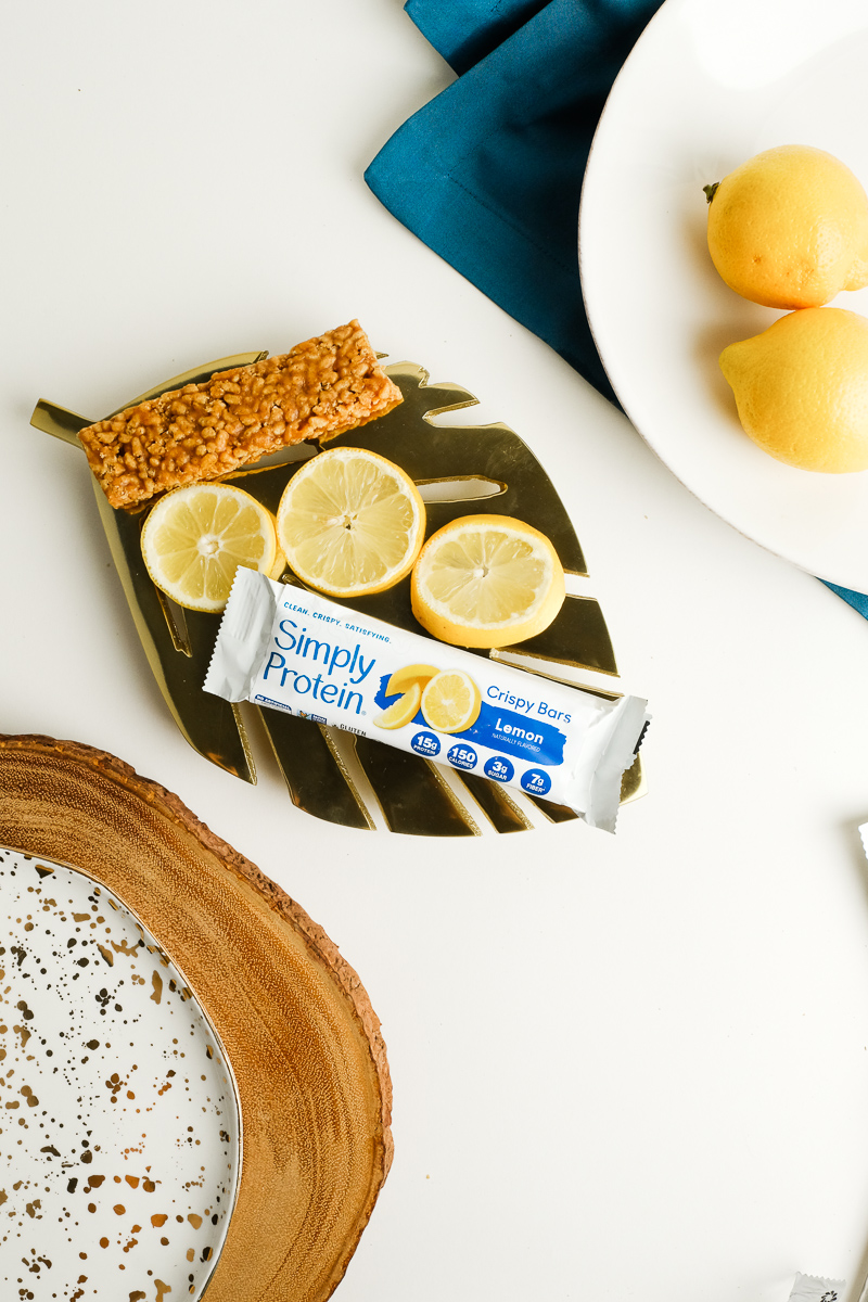
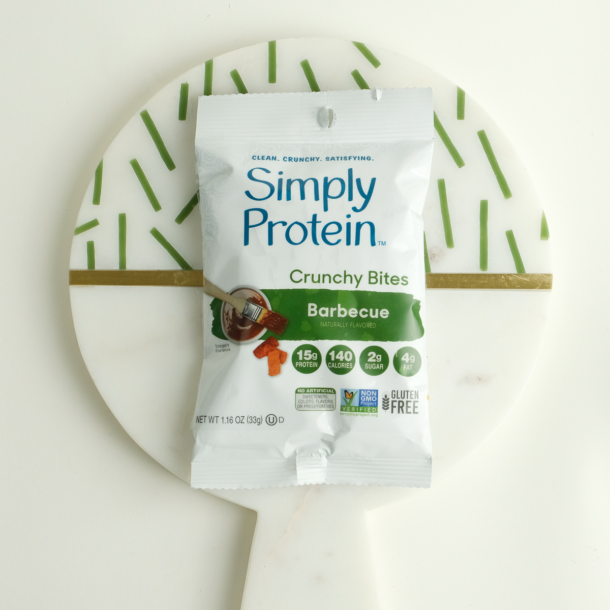
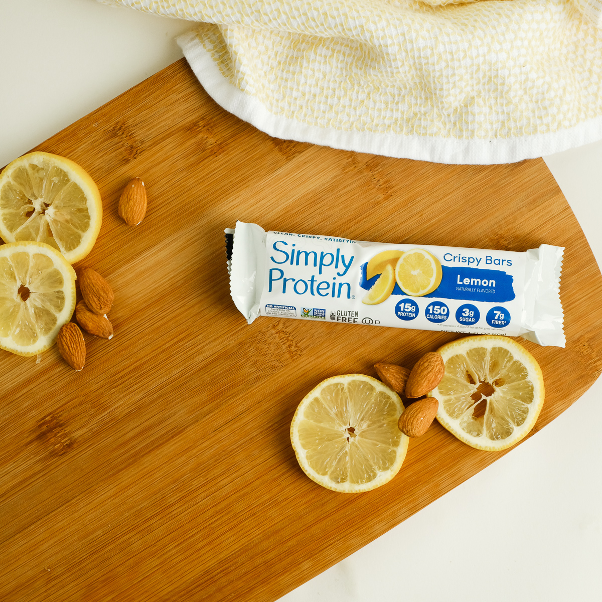
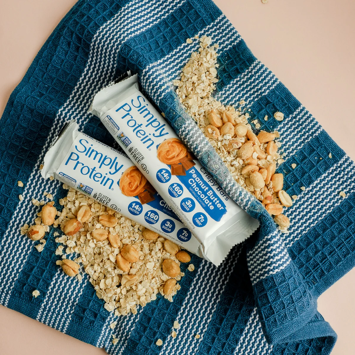
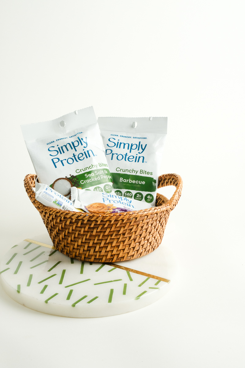
Simply Protein
Working with CRC’s client SimplyProtein for their American launch to create clean and minimal visual imagery for their instagram. This project involved working directly with the SimplyProtein team to create strong branding and target audience. Competitor research, art directing and being the photographer for this shoot.


//video producer//
//creative director//
//prop styling//
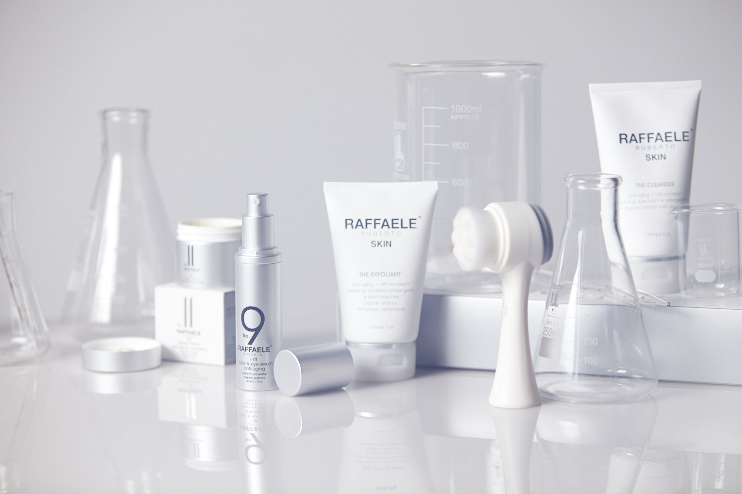
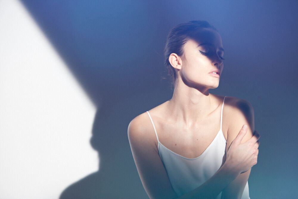
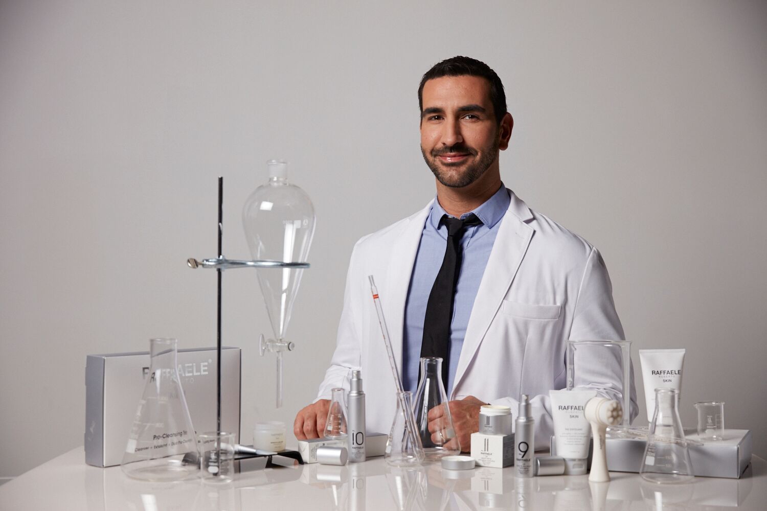
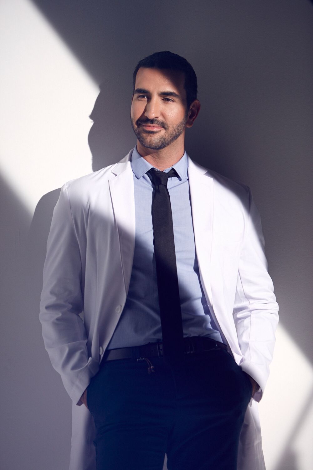
raffaele ruberto
I worked with this luxury skincare client under Apex as the Creative Director working directly with Raffaele Rubeto to together create a beautiful visual campaign to reflect his new series of products SKIN.
I was the producer on the two-day video shoot where delivered 8x tutorial videos, a campaign video, and product photography for web.
Fashion Design Project
//fashion design//
//graphic design//
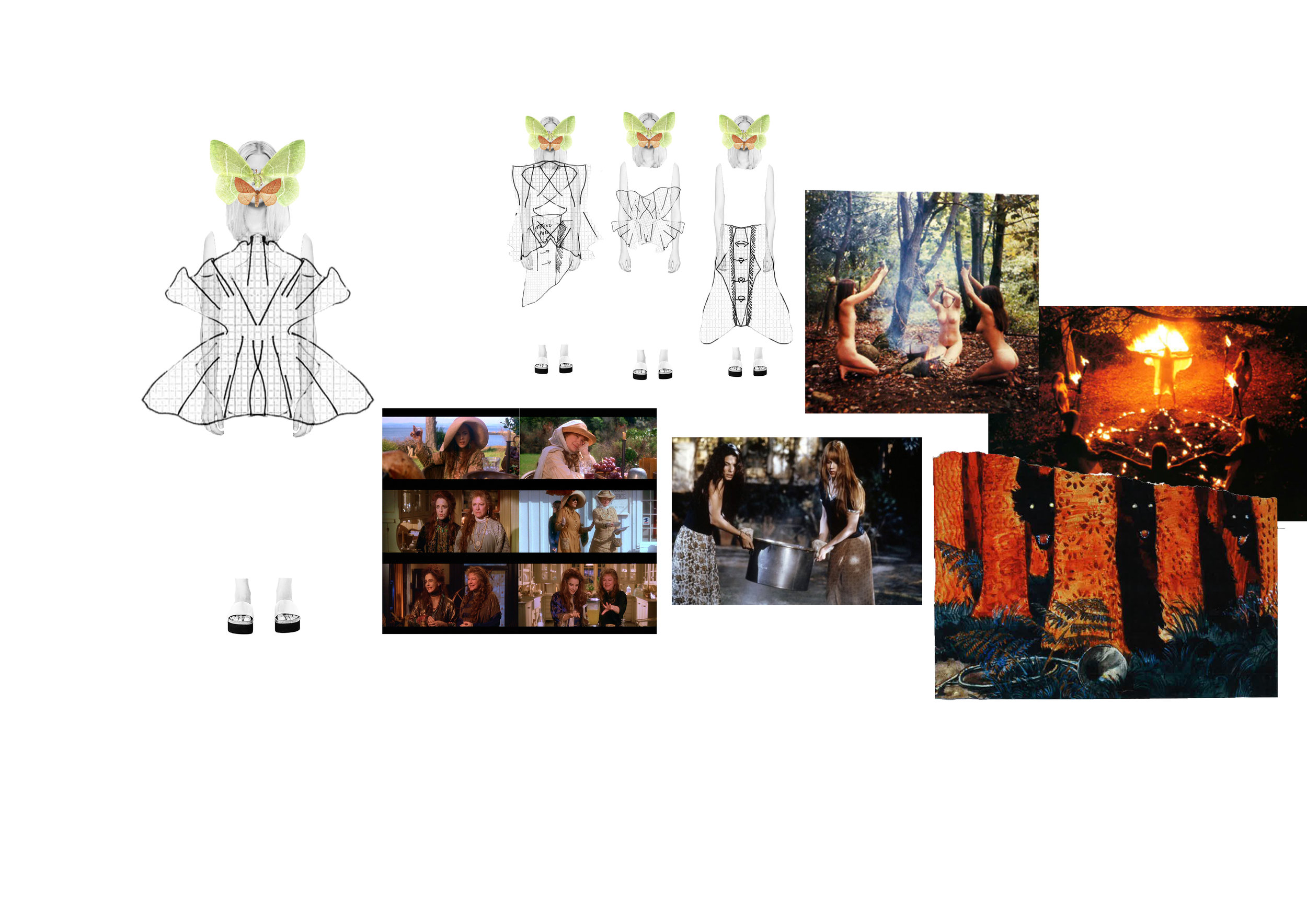
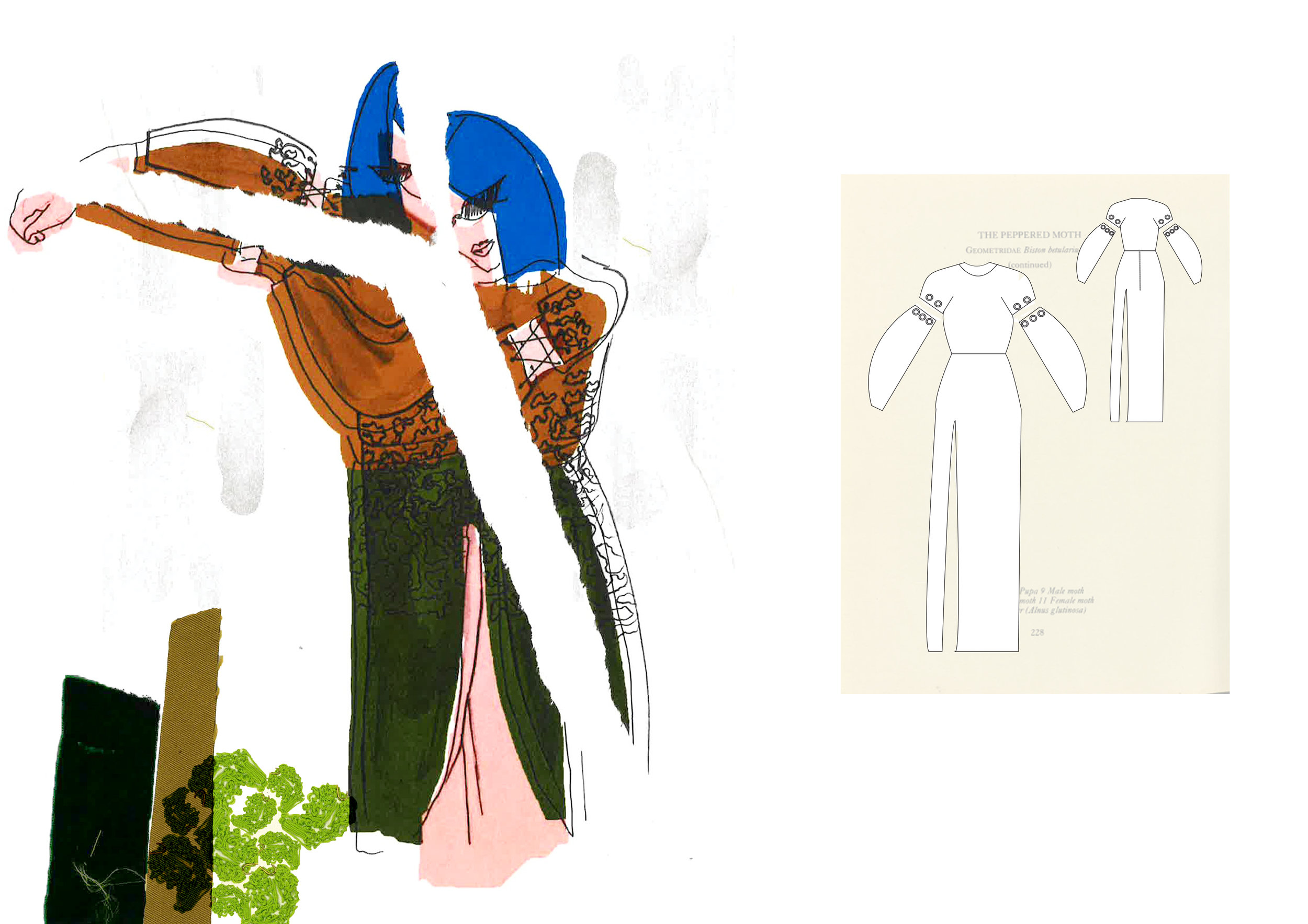
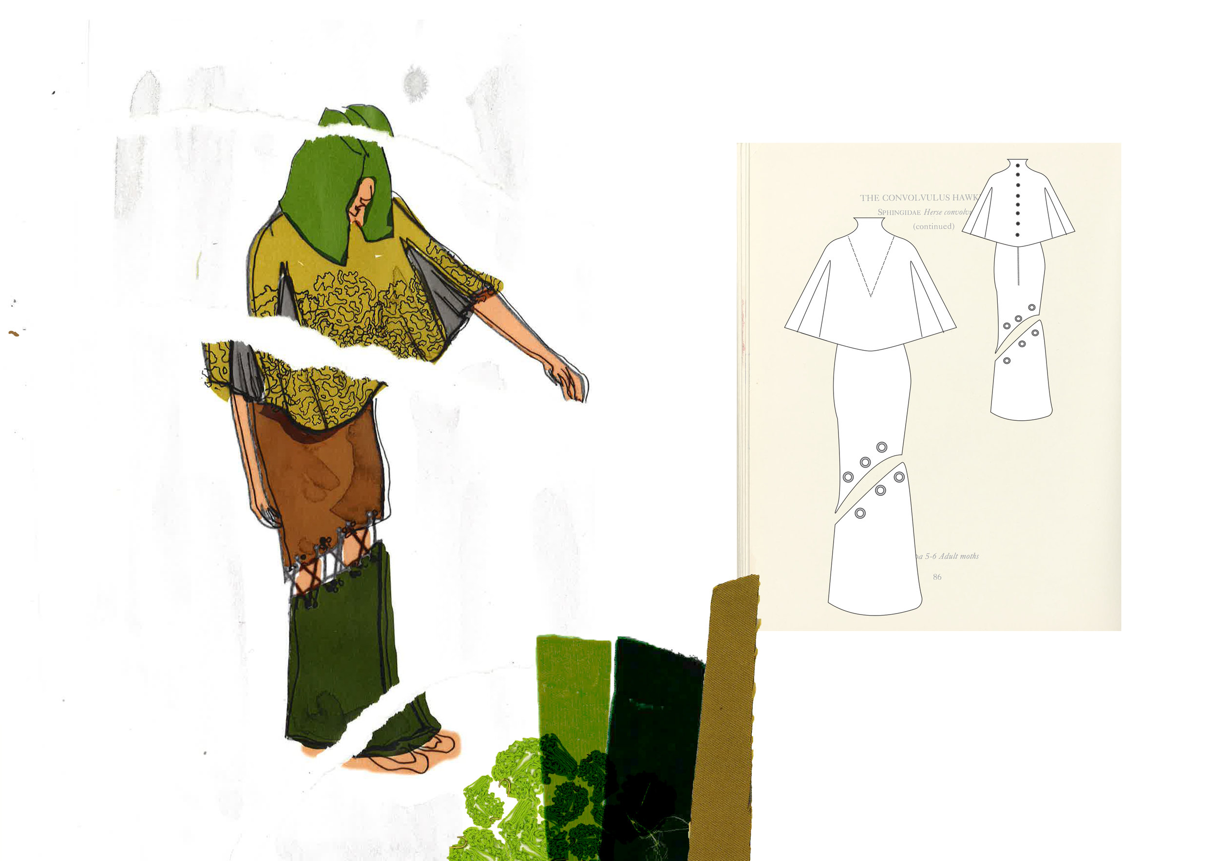
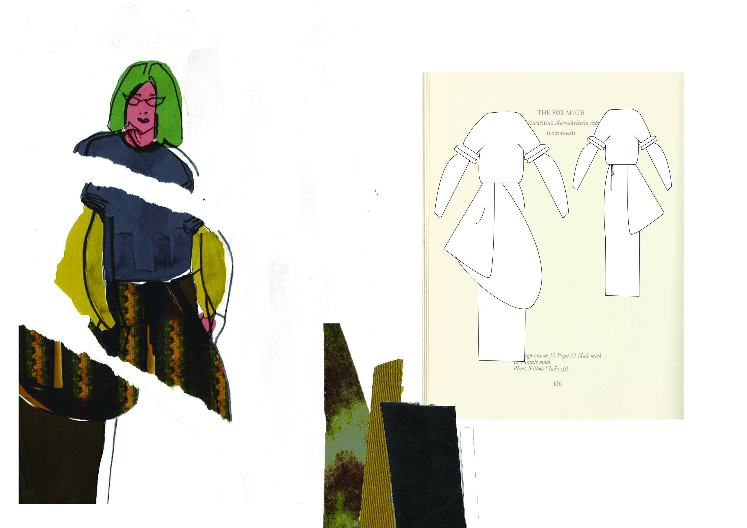
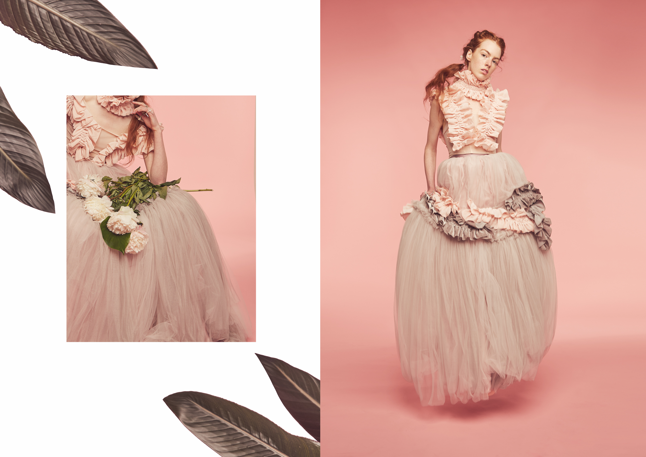
Of Lichens & Witches
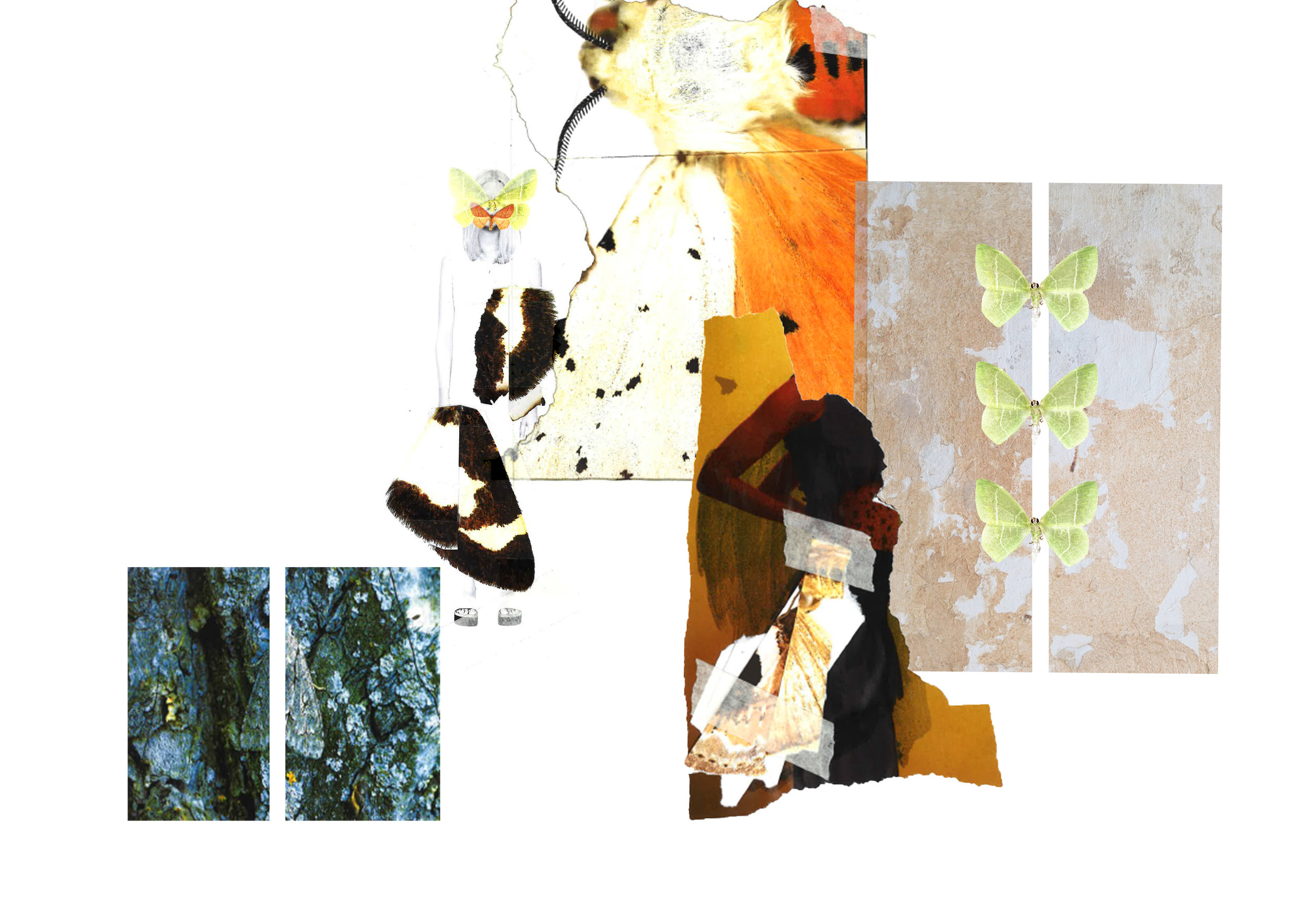
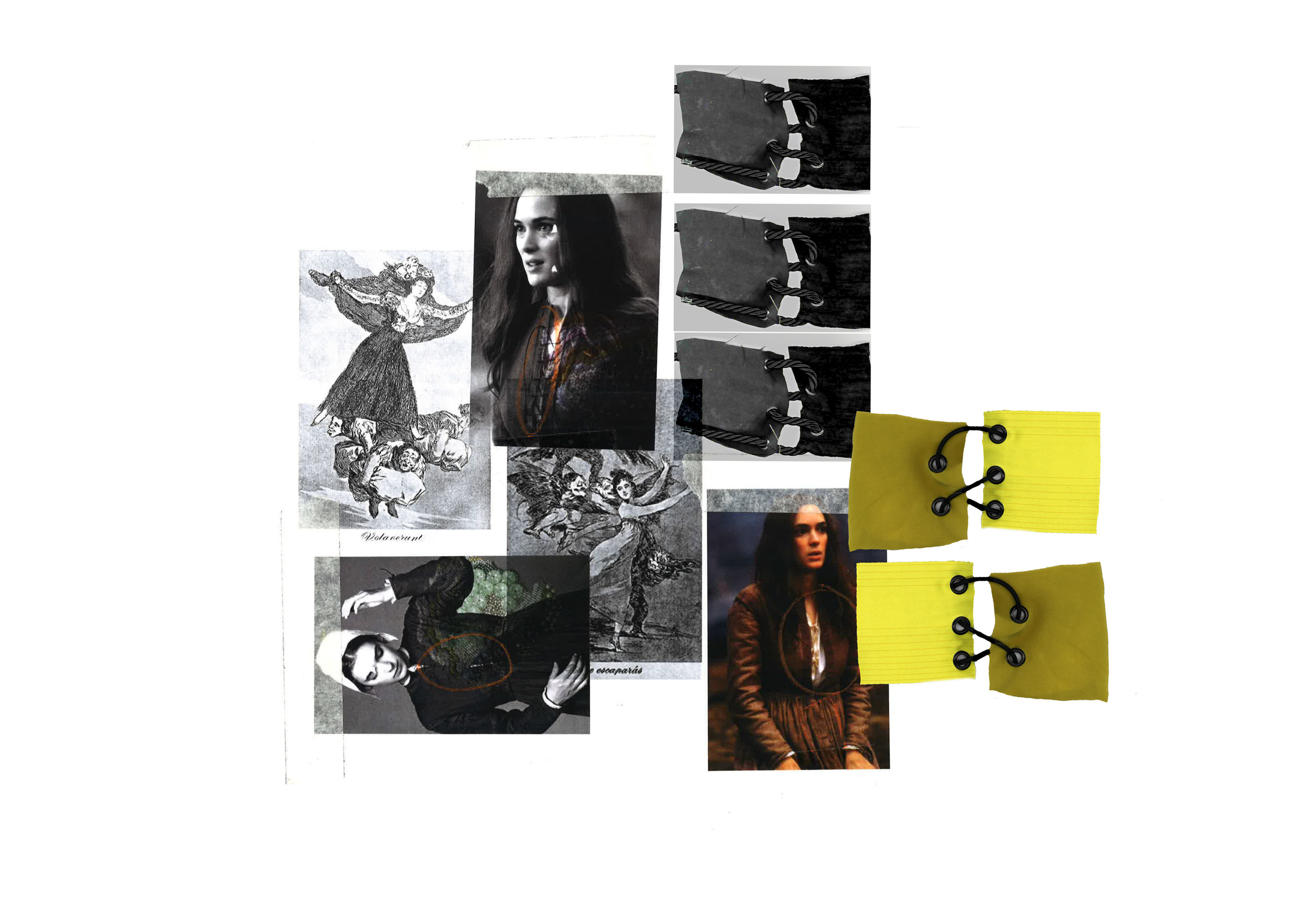
Inspired by my early fascination of magic and witchcraft, I revisited the historical context of ‘the witch’ for my pre-collection. Focusing in on European and American witchcraft, I tracked the movements from the witch-hunts to modern day witchcraft, such as Wicca and Feminist Witches. Witches leave a obvious trail in society, with many branches of research, both positive and negative such as the Occult, Satanists, and the role of women.


Details
Design elements from lichens created in nature, silhouettes created with moth shape details using collage to create design details for the collection.


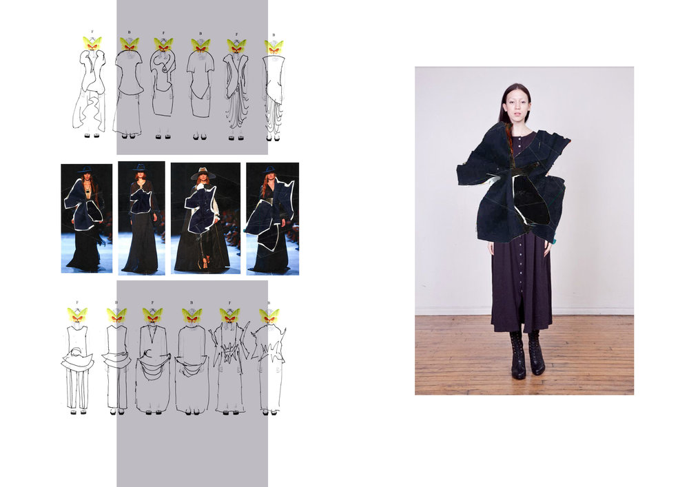


Designs
The line-up is a cohesive mix of forest colors, using oversized and asymmetrical silhouettes, creating an otherworldly mystical designs.


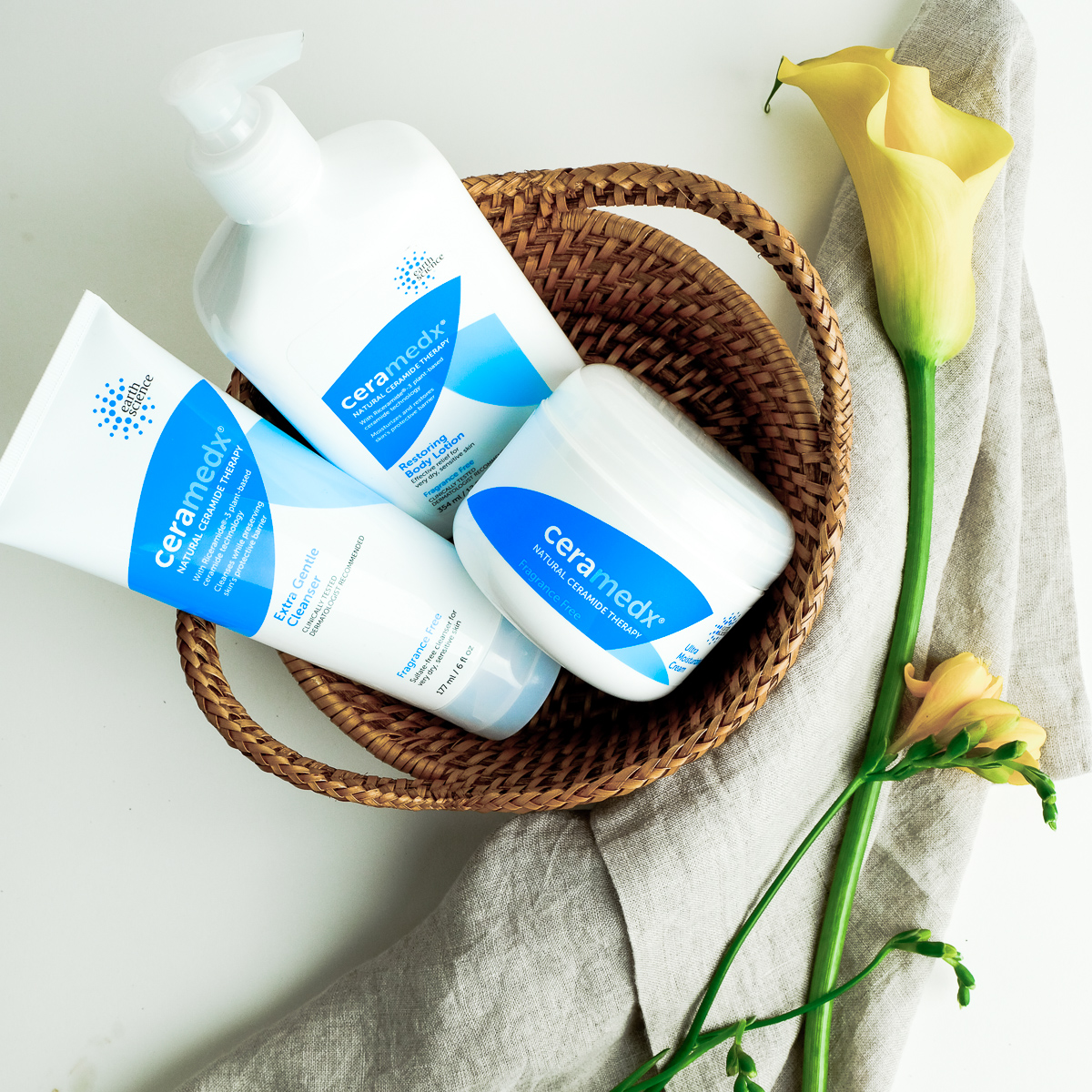
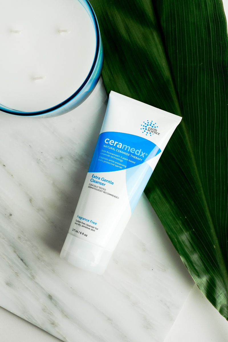
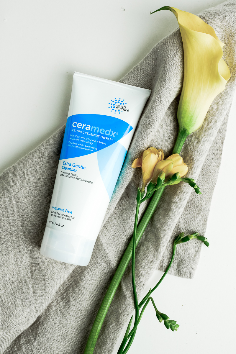
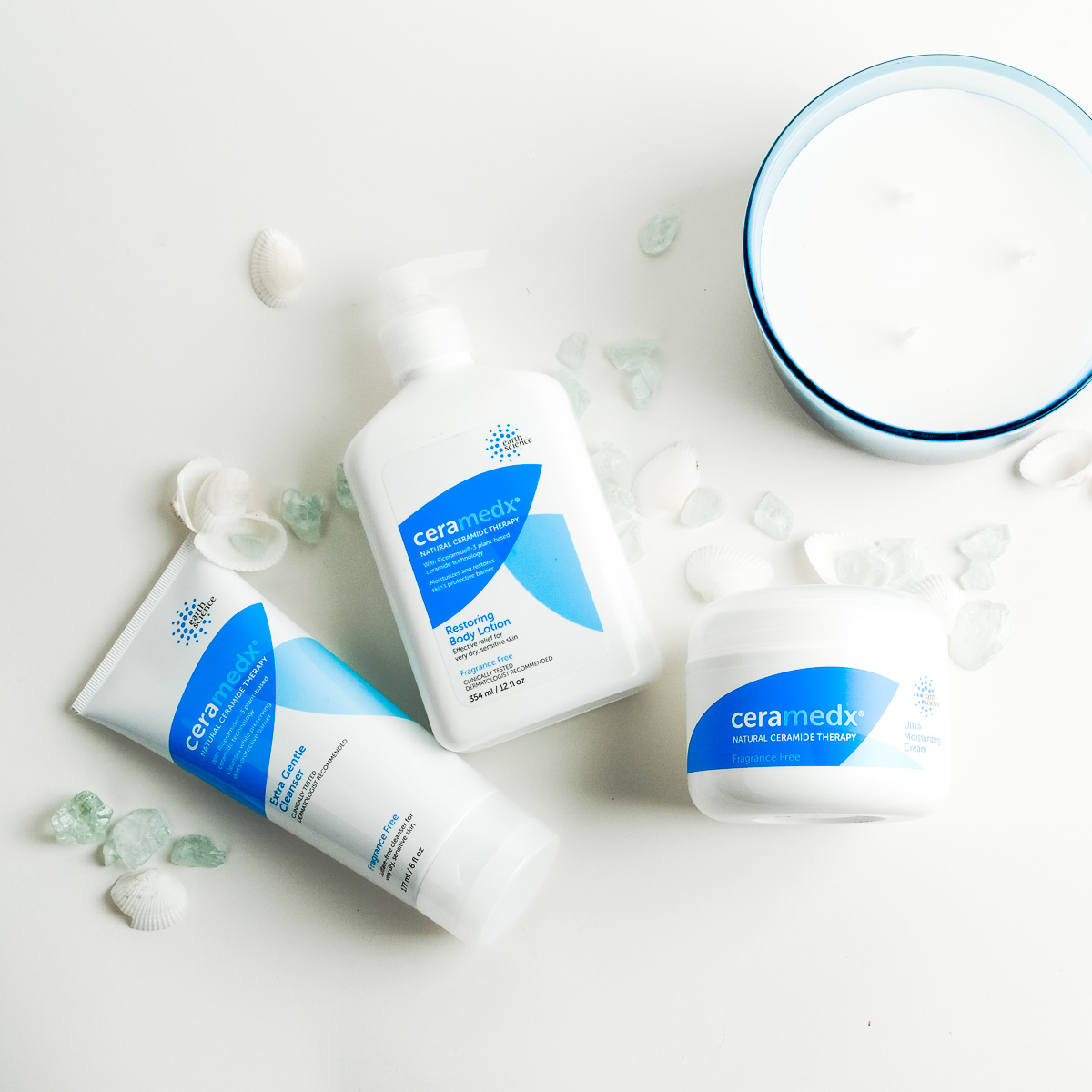
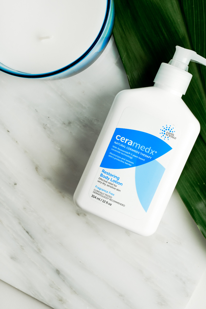
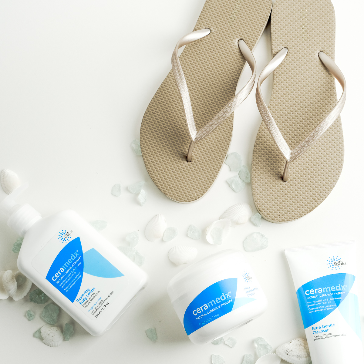
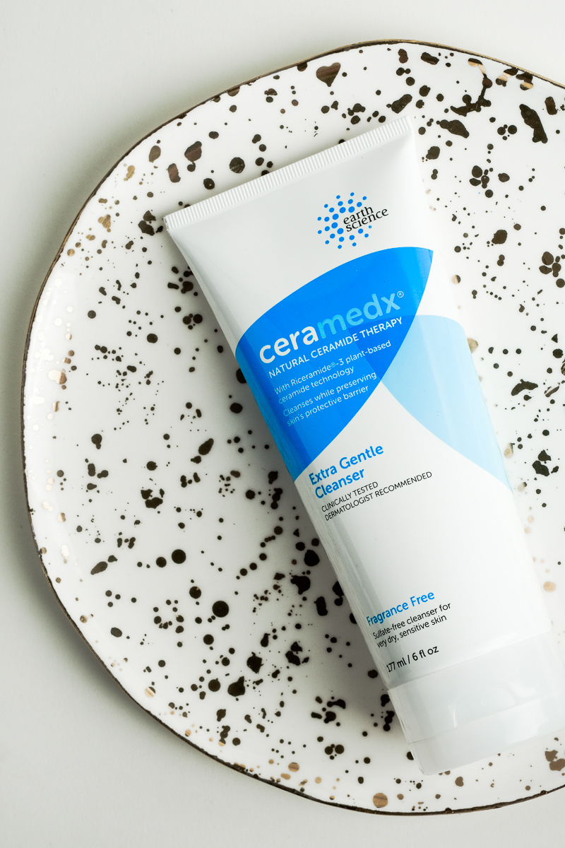
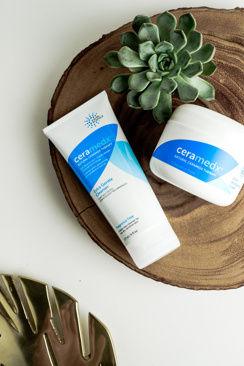
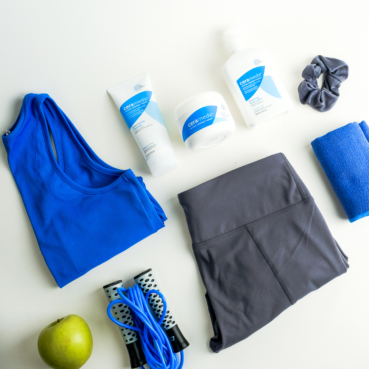
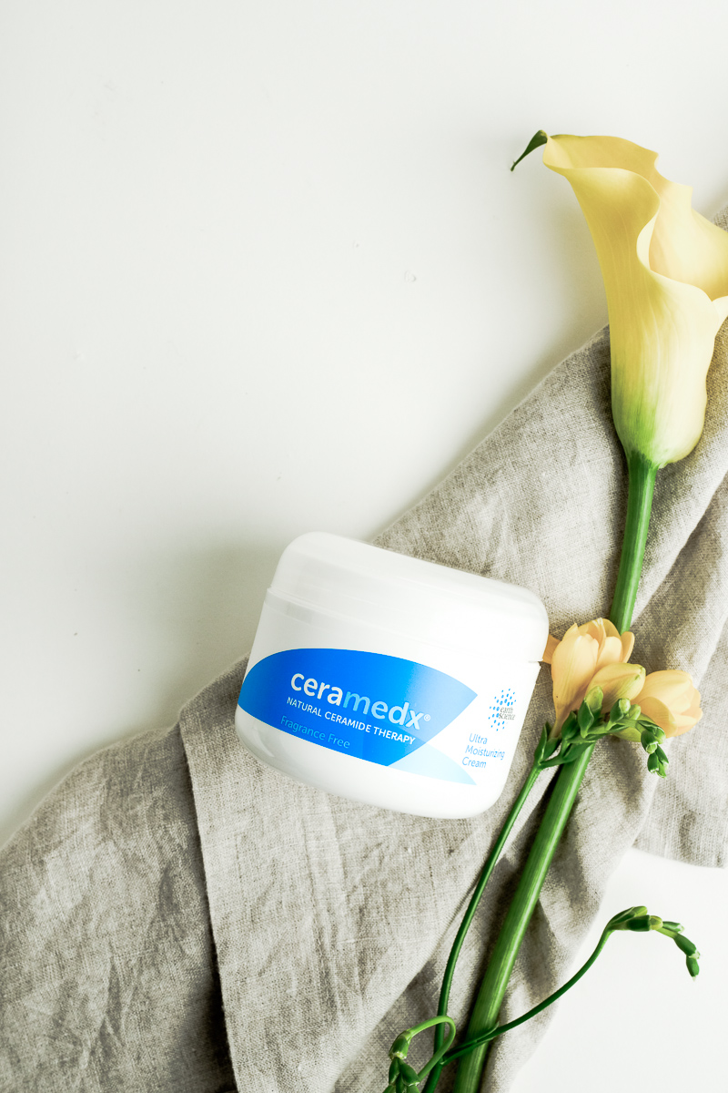
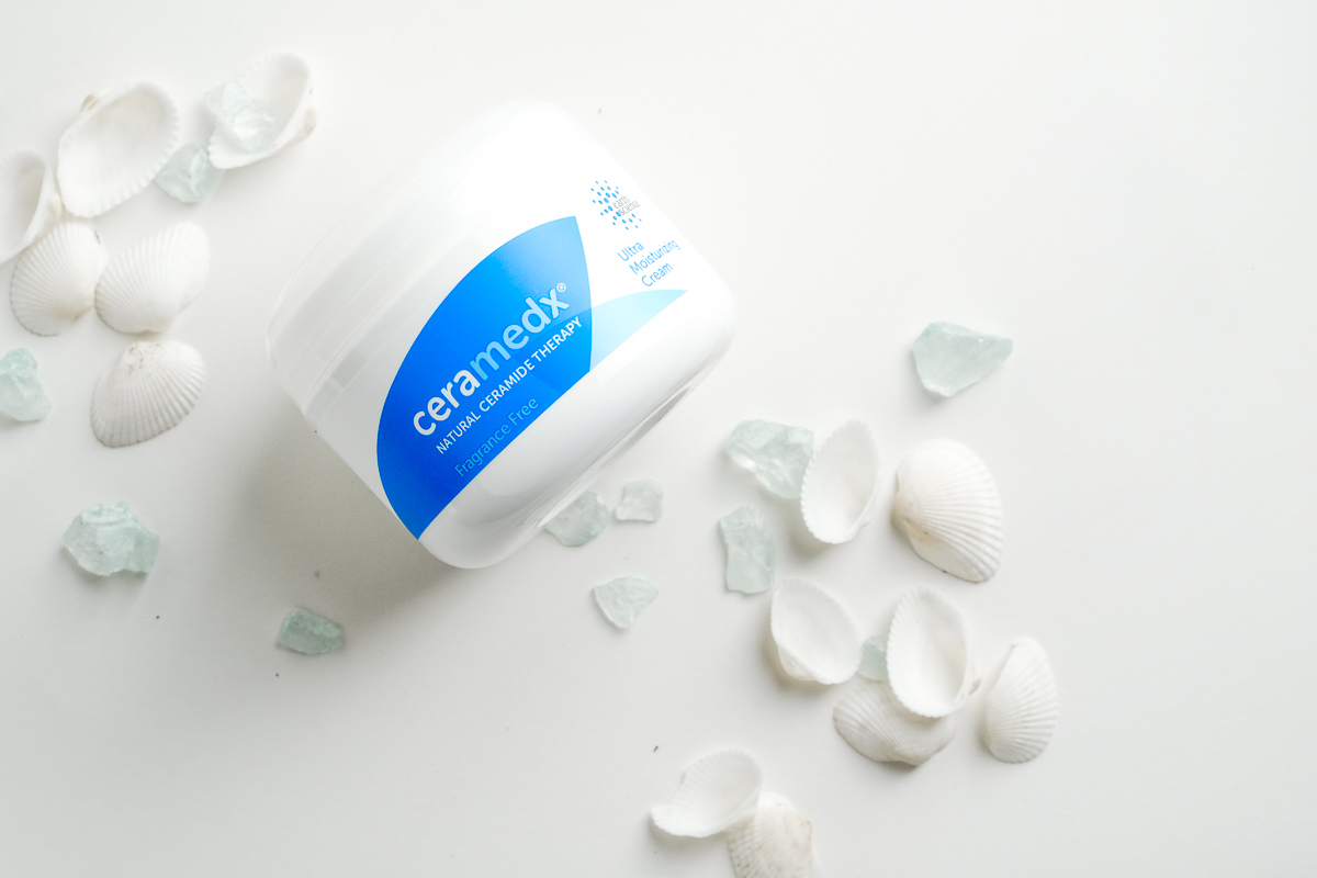
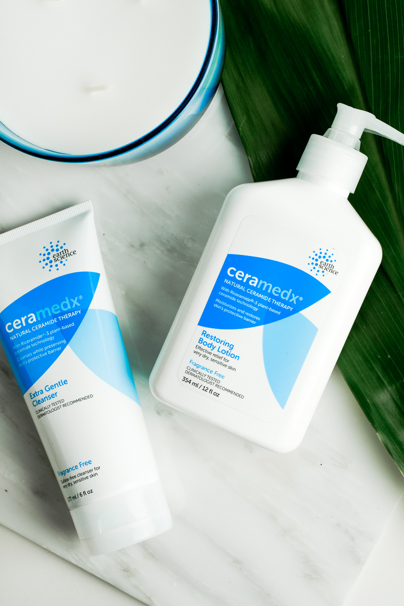
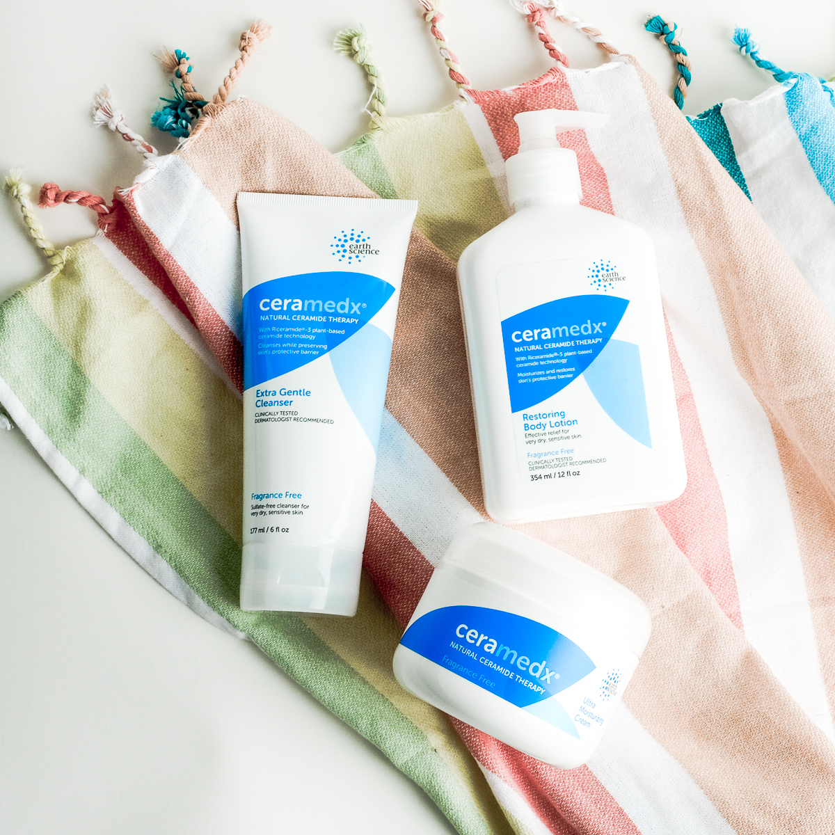
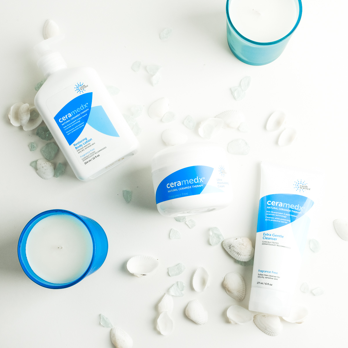
Ceramedx
Working with PR Company’s client Ceramedx on their new branding for social media, I art directed, and did the photography for their Ceramedx skincare.


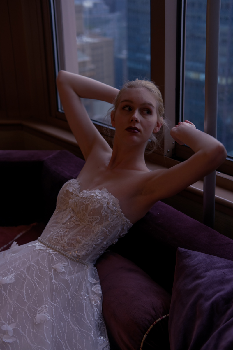
Birenzweig
Bridal Market week photography 2018


published: forest magazine
//art direction//
Forest Magazine
Designing the art direction on the shoot and during post-production, doing the graphic design myself. Published for Forest Magazine 'Realm of Enchantment' Issue 2018
Photographer: Mani Zarrin (@manizarrin)
Art Director: Rebecca Rampersaud (@rebecca.rampersaud)
Fashion Stylist: Danielle Hawkins (@danielleh_styles)
Hair stylist: Matthew Green (@matthewgreenhair)
Makeup artist: Sawako Kijima using MAC Cosmetics (@sawaart23 @maccosmetics)
Producer: Sheri Chiu (@sheri.chiu)
Model: Pong Lee @ Supreme (@its_pong@suprememgmt)
Photographer Assistant: Derick Marques @out_of_fifty


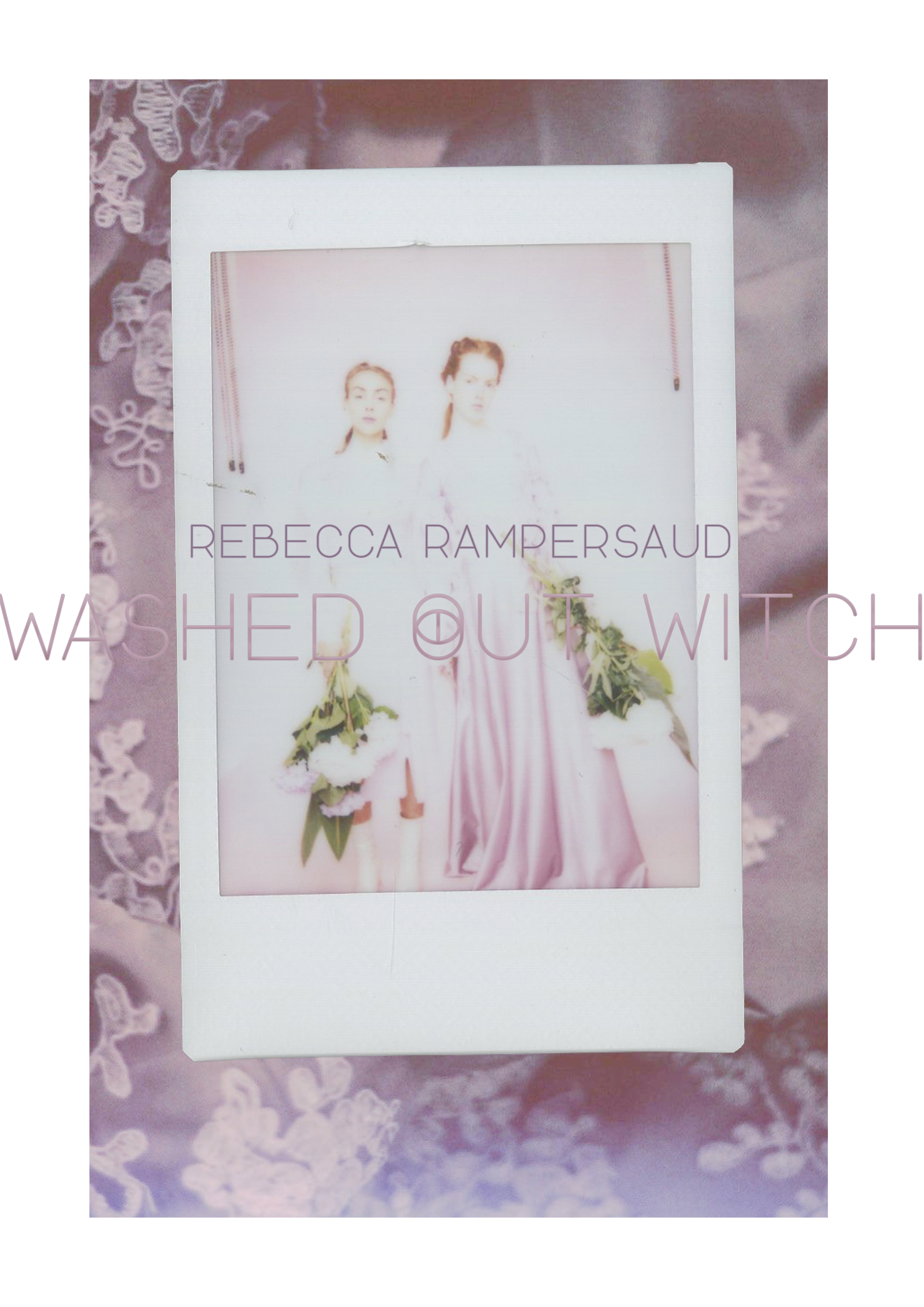
washed out witch
// fashion design + creative direction //
lookbook: rebecca rampersaud
//fashion design//
// art direction //
//graphic design//
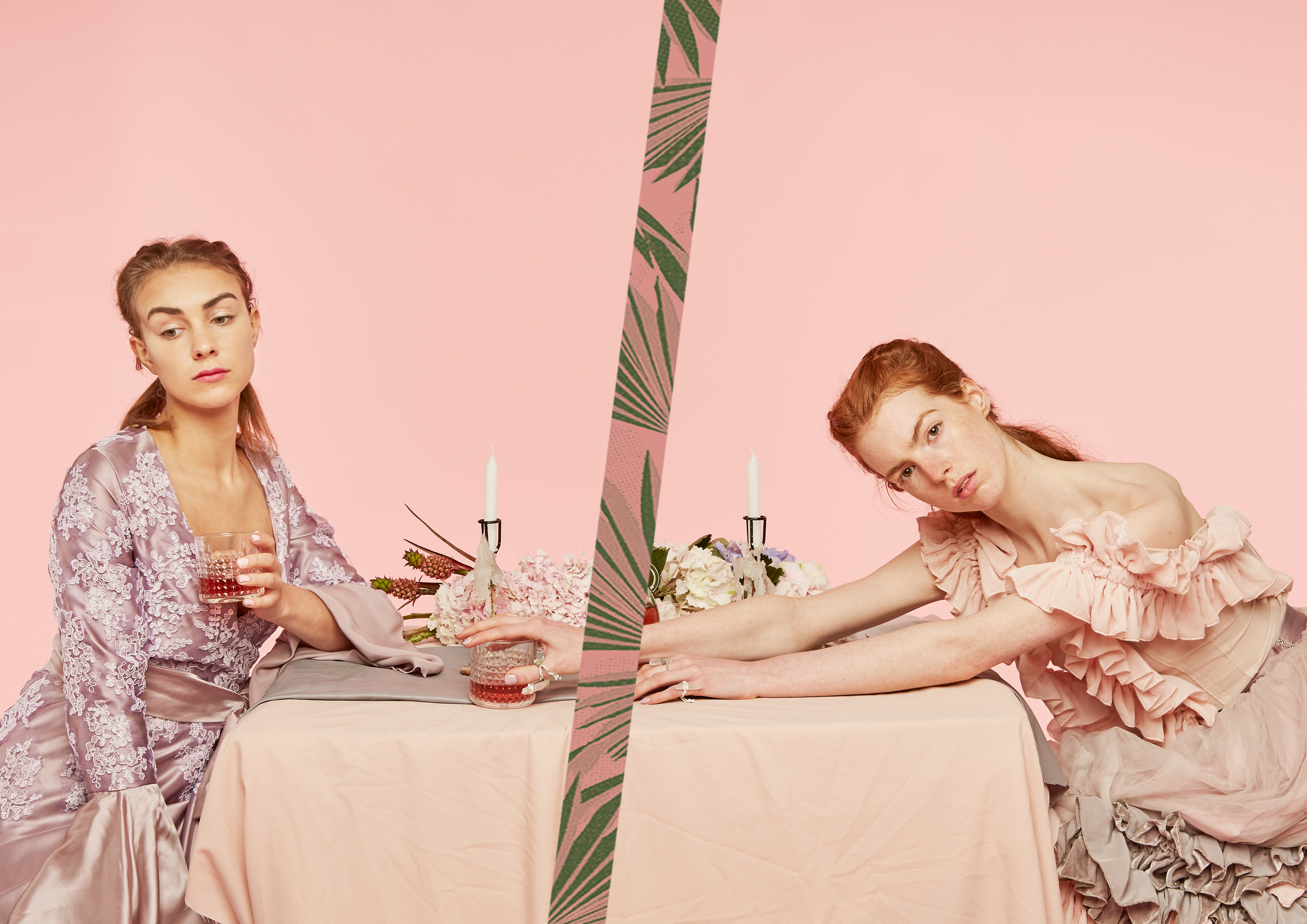
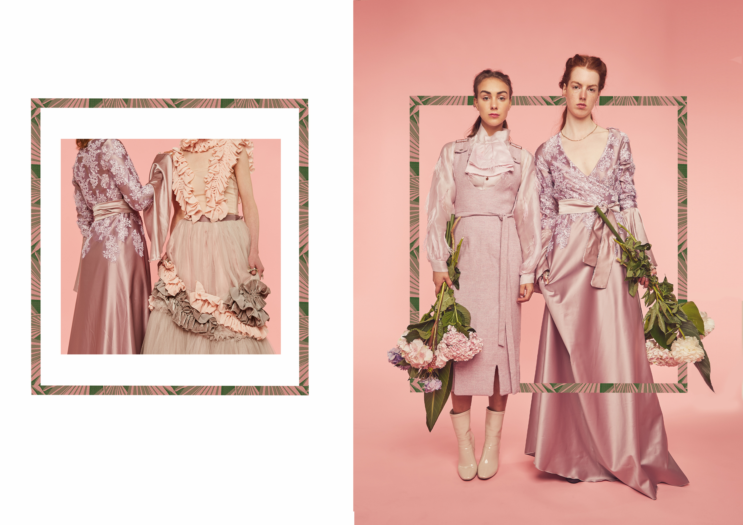
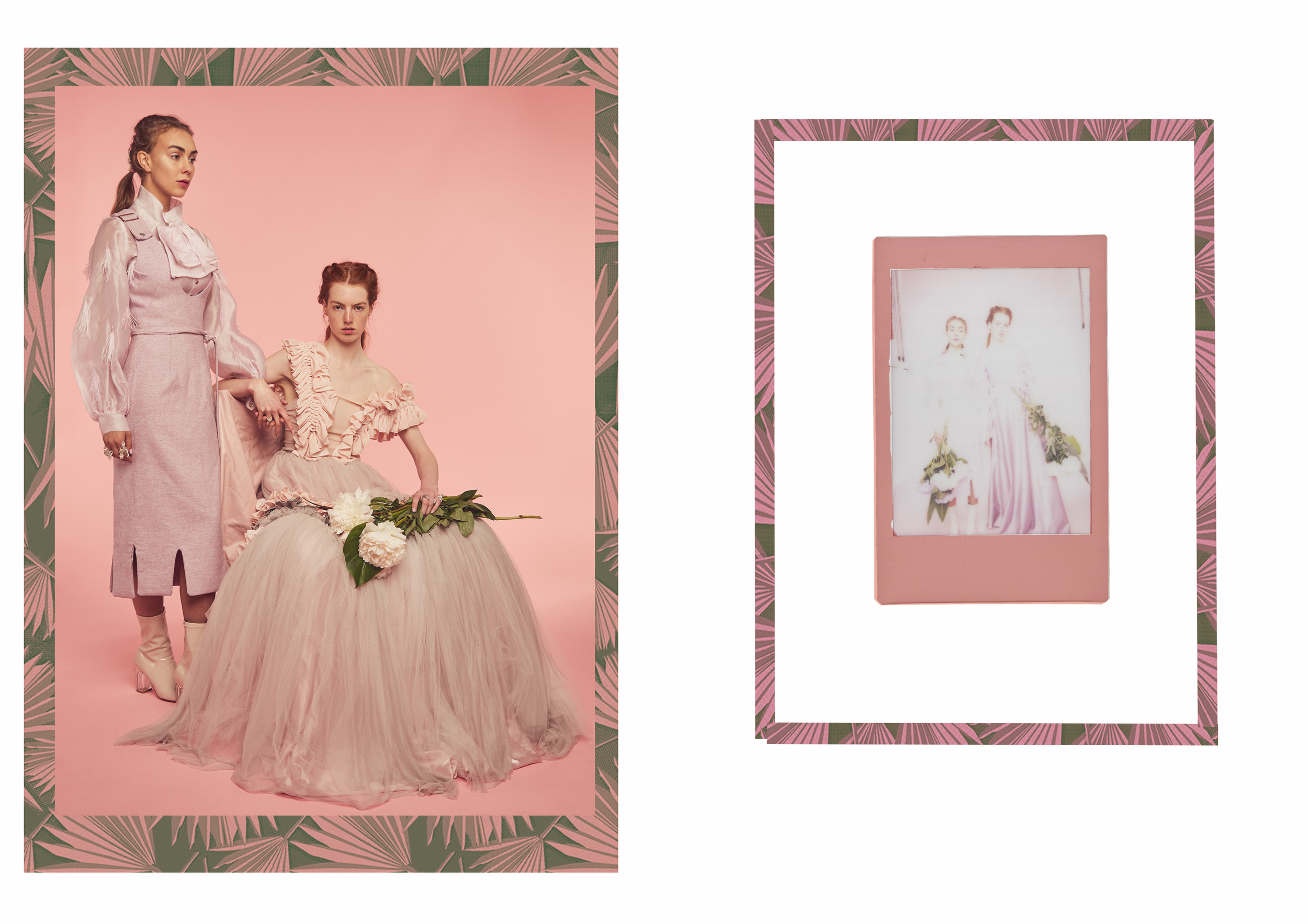
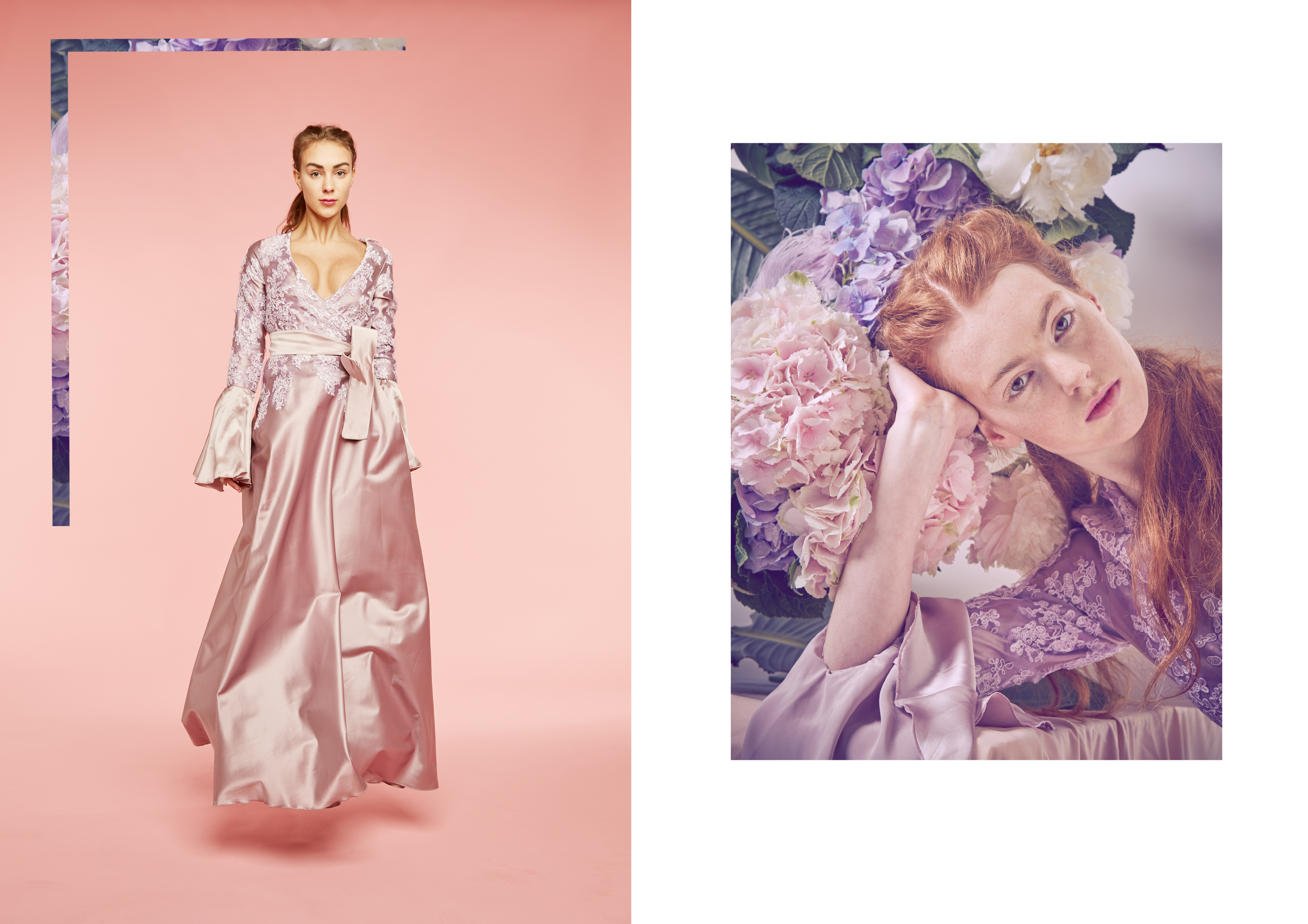
washed out witch
My Final Collection from Middlesex University 'Washed Out Witch' was inspired by cult horror films like Carrie and Suspiera. The idea that women represented in horror films often are dressed in white, lace, and innocent while they are actually the thing meant of fear. Combining that with the Feminist Witchcraft ideology that the three stages of a women's life is the Maiden, the Mother, and the Crone to create an empowering and visually beautiful collection.
Photography: @cameron815 & @james.monahan
Models: @annaapye @elodiesm

apex creative
//graphic design //

apex postcards
Creating a series of postcards for Apex Creative NYC as Apex's Creative Director for clients.

back
I developed a visual representation of Apex's process, designing each of the icons on the postcard, as well as graphically designing the front and back of the postcards.


anthropologie
//graphic direction//
//moodboarding//
//fashion design//
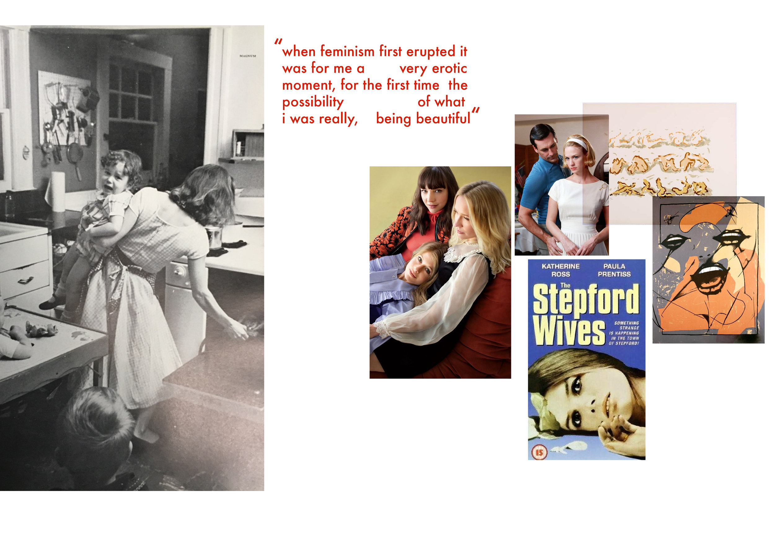
a liberated woman
anthropologie
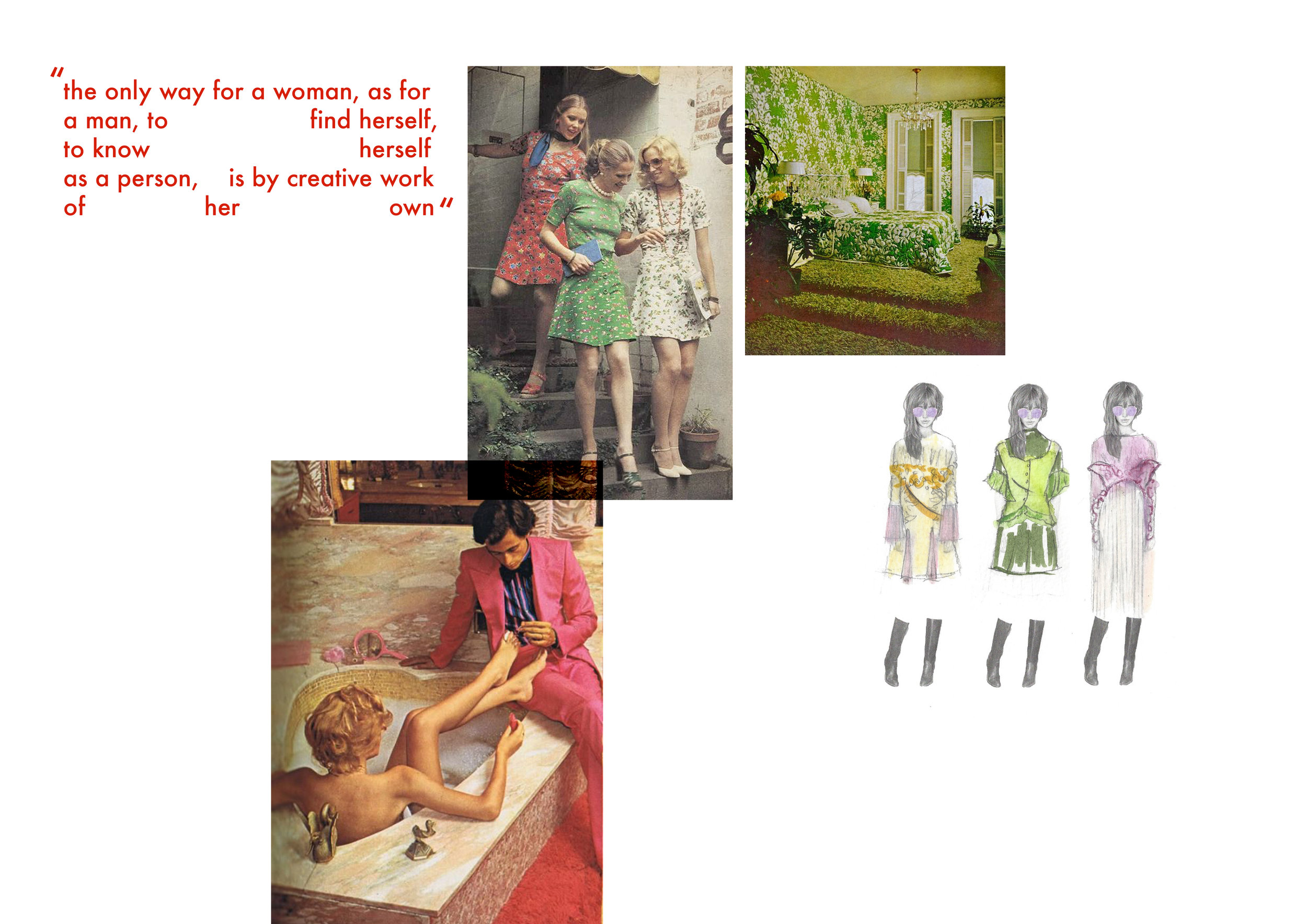
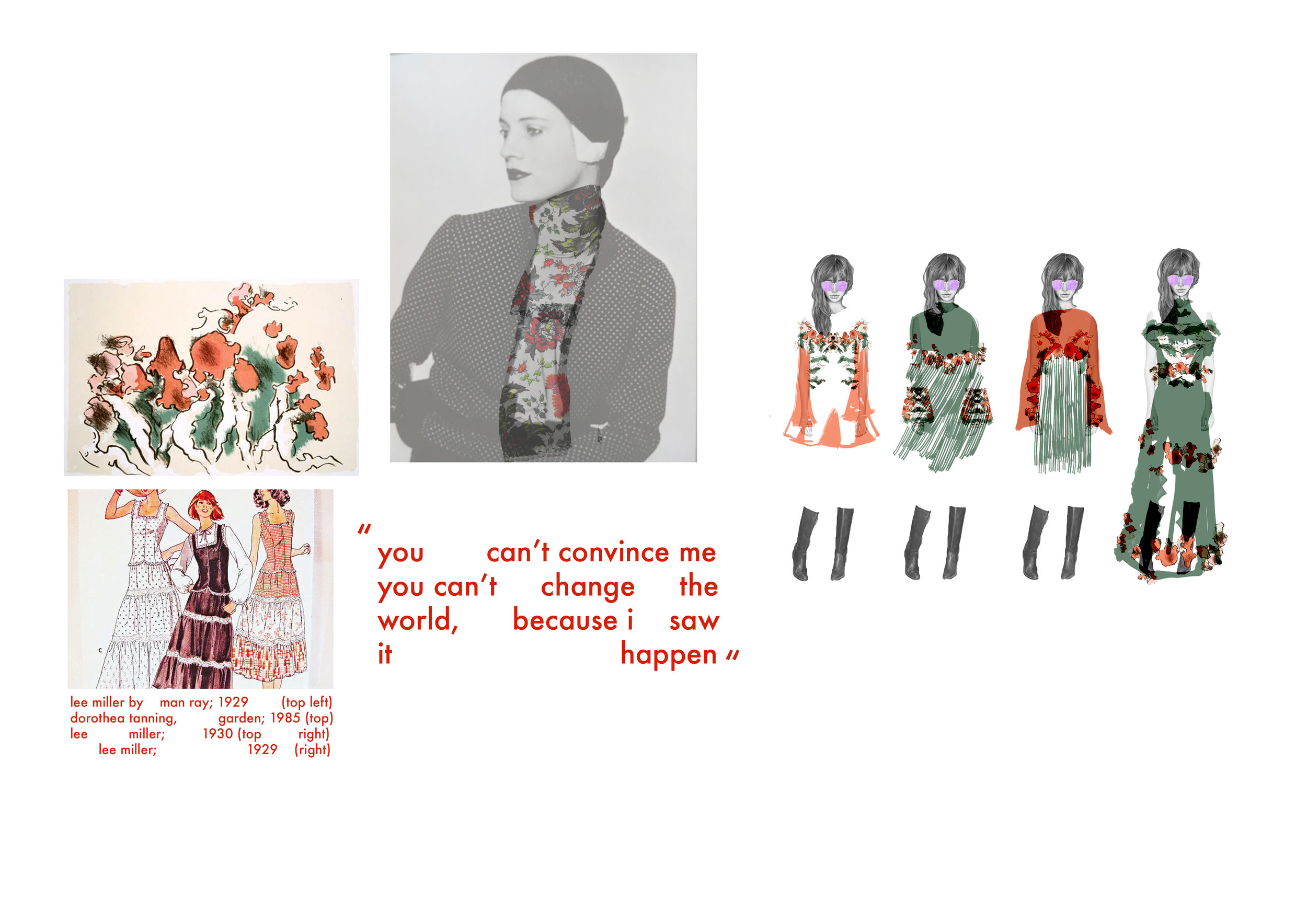
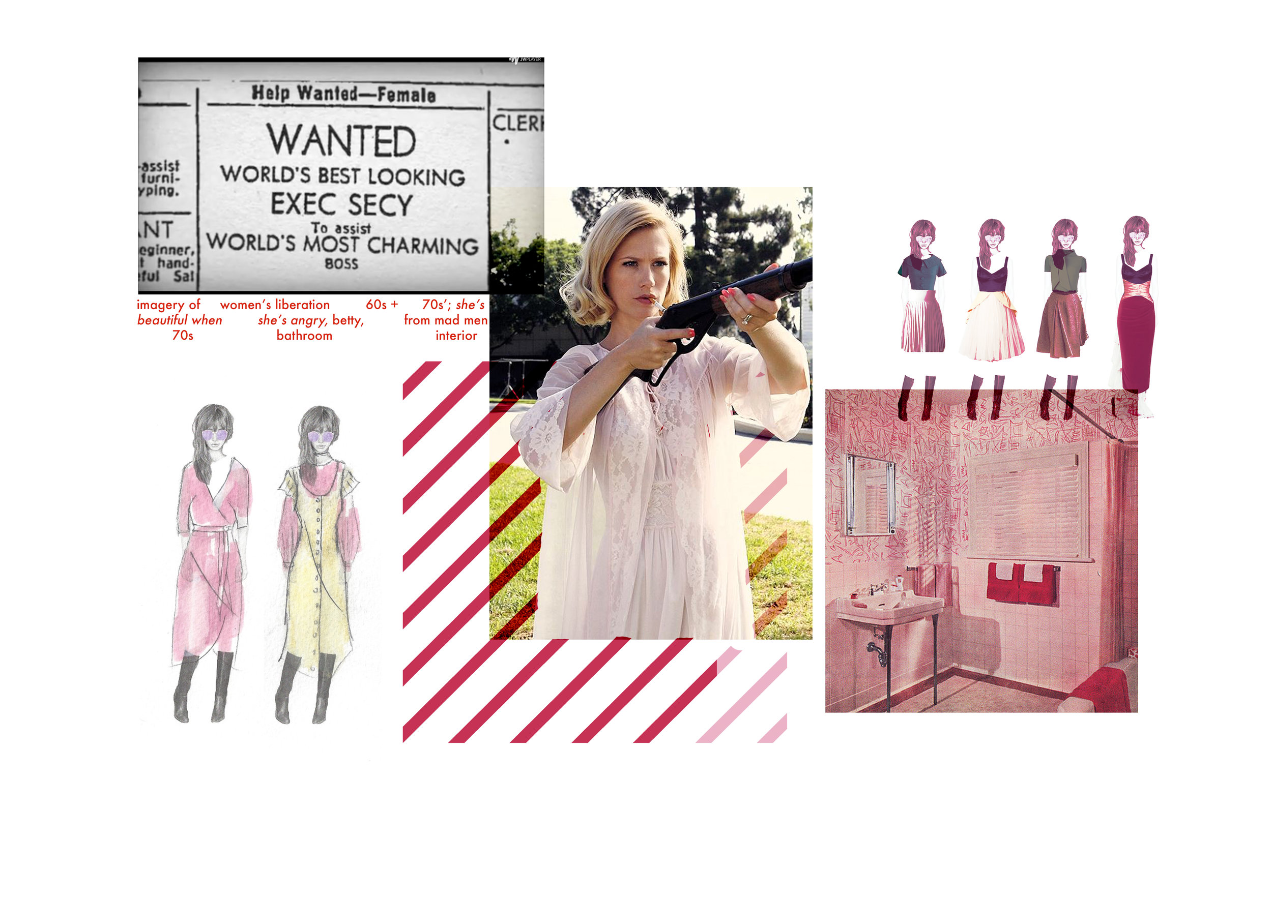
Design project for Anthropologie based off the women's liberation of the 60s and 70s drawing inspiration from the American housewife culture of the time with the contrast of the women's movement of the time.
Using elements of design with the color palette from bright pastel 70s bathrooms and surrealist photographer Lee Miller. Silhouettes inspiration from modern adaptations such as Mad Men, Good Girls Revolt and the Stepford Wives.
The collection is the designed for an empowered women with red embroidery elements and strong silhouettes.


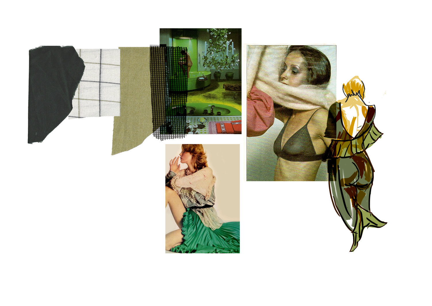
Designs
Gives reference to soft silhouettes and a pastel color palette, with an empowered edge.